Floor Textile Contrast Calculator
How to Use This Tool
Answer these three questions based on your specific room conditions. The tool will provide personalized recommendations for your rug-to-carpet contrast based on the principles explained in the article.
Your Personalized Recommendation
Based on your room conditions, your rug should be than your carpet.
Why This Works
Key Takeaways
- Light carpet + dark rug: Creates definition and grounds the space
- Dark carpet + light rug: Lifts the room and creates airiness
- Texture can create contrast even when tones are similar
- Always test in actual room lighting before purchasing
When you’re standing in the middle of your living room, looking at the carpet underfoot and the rug you’re thinking about adding, one question pops up: Should rug be darker than carpet? It’s not just about aesthetics-it’s about balance, function, and how light moves through your space. The answer isn’t a hard rule. But knowing the why behind the choices will help you make a decision that actually works in your home.
Why Color Contrast Matters
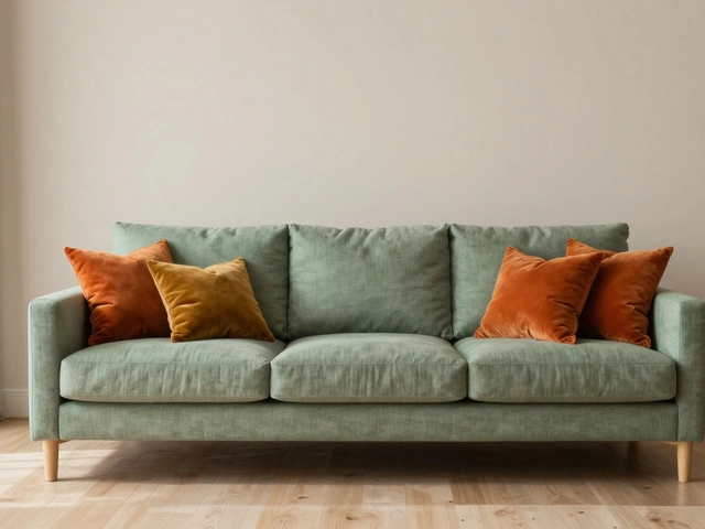
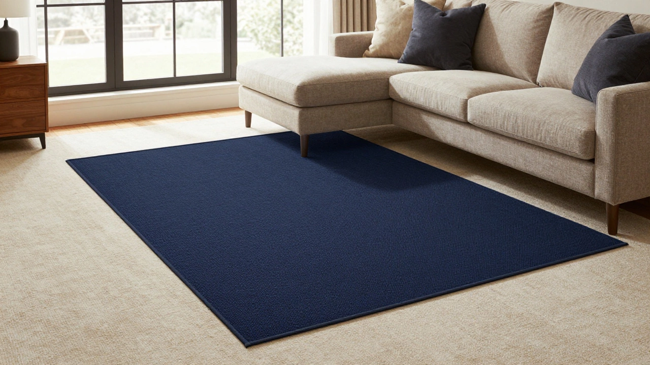
Your floor isn’t just a surface-it’s the foundation of your room’s visual weight. If your carpet is light, like beige or soft gray, adding a darker rug creates definition. It grounds the space. Think of it like wearing dark shoes with light pants. It anchors you. On the flip side, if your carpet is already dark-say, charcoal or deep brown-a lighter rug can lift the room, making it feel airier and more open.A common mistake is choosing a rug that’s too close in tone to the carpet. You end up with a flat, muddy look. The goal isn’t to match. It’s to layer. Texture and contrast are what give depth. A 2023 study by the New Zealand Interior Design Institute found that rooms with layered flooring (carpet + rug) had 37% higher perceived warmth and comfort ratings than those with single-floor surfaces.
Real-Life Scenarios
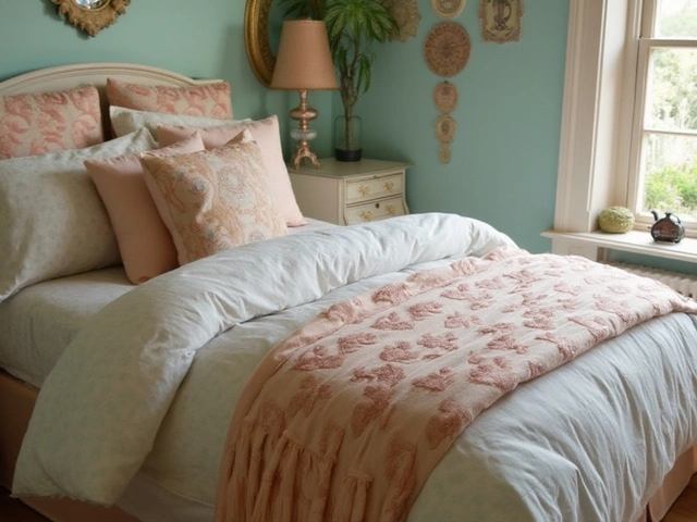
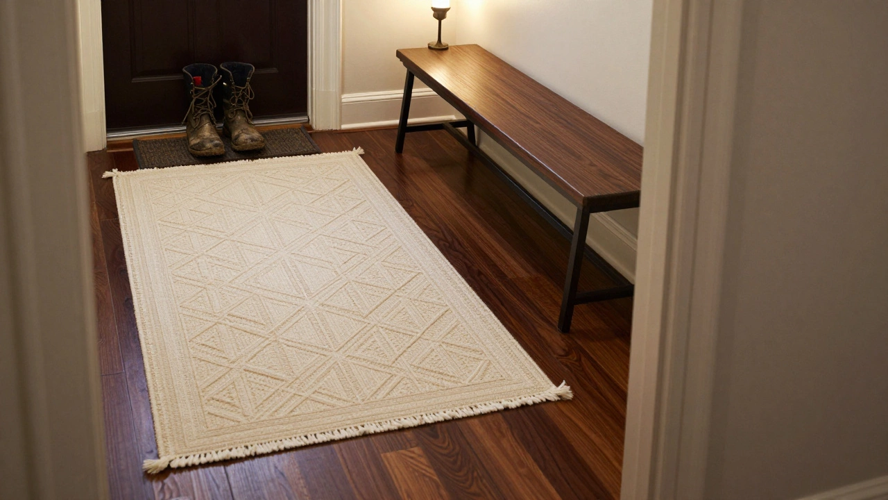
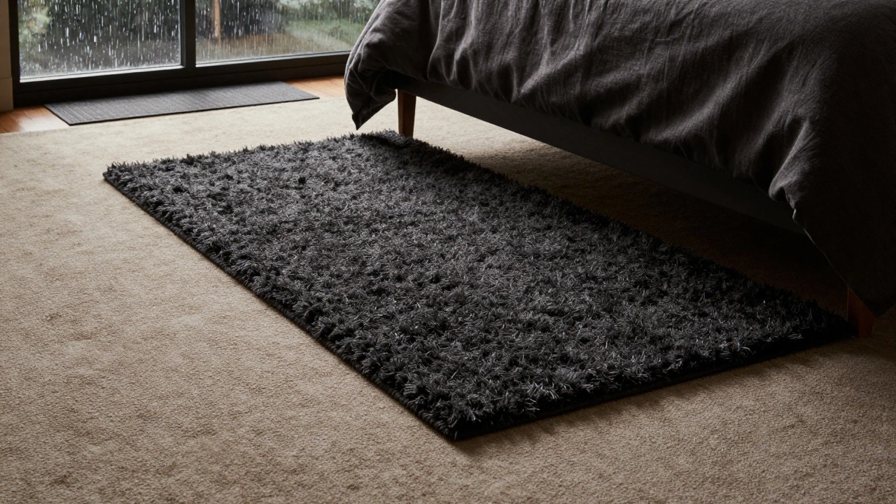
Let’s say you’ve got a light oatmeal-colored carpet in your bedroom. You love the softness underfoot, but the room feels too washed out. A deep navy or charcoal rug under the bed? Instant coziness. It pulls the eye down, adds structure, and makes the space feel intentional.Now imagine a dark walnut-colored carpet in your entryway. It’s durable, hides dirt, and works well with high traffic. But now the space feels heavy, especially if the walls are also dark. A cream or pale gray rug with a simple geometric pattern? It breaks the monotony. It invites people in. It says, “Stop here. Breathe.”
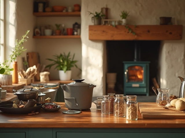
In Wellington, where rain and wind mean muddy boots and wet socks, darker rugs over lighter carpets are practical. You get the softness of carpet underfoot, and the rug takes the brunt of dirt. Clean one surface, not both.
How Light Affects the Choice
Natural light changes everything. Rooms with lots of windows? You can get away with deeper rug colors. The light bounces around, balancing the darkness. But in a north-facing room or one with small windows, going too dark can make the space feel smaller. In those cases, a rug that’s one or two shades darker than the carpet is enough. Think of it as a subtle shadow-not a blackout.Artificial lighting matters too. Warm white bulbs (2700K-3000K) soften dark tones. Cool white (4000K+) can make dark rugs look harsh. Test your rug sample under your actual room lighting before buying. Bring a swatch home. Lay it on the carpet for a day. See how it looks at 7 a.m. and 8 p.m.
Texture Over Tone
Color isn’t the only tool you’ve got. Texture can create contrast even when tones are similar. A plush, shaggy rug over a tight-looped carpet adds dimension. A flat-weave jute rug over a thick pile carpet gives you a tactile contrast that’s just as satisfying as color difference.Some of the most striking interiors I’ve seen in Wellington homes use the same color family-think taupe over taupe-but different textures. One is smooth, the other is nubby. One reflects light, the other absorbs it. The eye still reads them as separate layers. That’s the secret: contrast isn’t just about hue. It’s about how things feel, how they catch light, how they respond to movement.
What Not to Do
Don’t pick a rug that’s lighter than your carpet unless you’re going for a very specific, modern look. Light-on-dark floors can work, but they often make the rug look like a stain or an afterthought. It’s harder to pull off.Avoid rugs with busy patterns if your carpet has any texture or pattern at all. You’ll end up with visual noise. Stick to solid rugs or very simple geometrics when layering over patterned or textured carpet.
And please, don’t buy a rug just because it’s on sale. A rug that doesn’t work with your floor will look wrong for years. It’s not a quick fix. It’s a long-term relationship.
Practical Tips for Choosing
- If your carpet is light, go 1-2 shades darker with your rug. Navy, charcoal, forest green, or deep brown are safe bets.
- If your carpet is dark, choose a rug that’s 1-2 shades lighter. Cream, oat, pale gray, or soft beige.
- Size matters. Your rug should extend at least 12 inches beyond the furniture. In living rooms, it should sit under the front legs of sofas and chairs.
- Check the pile height. If your carpet is thick, pick a low-pile rug. Otherwise, the layers will buckle.
- Use a non-slip pad. It protects both your rug and your carpet. It also prevents tripping.
When to Break the Rules
Rules are guidelines, not laws. Maybe you love a bright red rug over a gray carpet. Go for it. Design is personal. But do it with intention. Ask yourself: Does this create energy? Does it feel balanced? Does it reflect how I want this space to feel?I’ve seen bold choices work: a mustard-yellow rug over a charcoal carpet in a minimalist home. It became the room’s heartbeat. A white rug over a brown carpet in a sunroom-gave it a beachy, airy feel. These weren’t accidents. They were decisions.
Don’t fear contrast. Fear indifference. A rug that blends in too much is a missed opportunity. The right contrast doesn’t shout. It whispers-and invites you to look closer.
Final Thought
Should rug be darker than carpet? Sometimes. Often. But not always. What matters is that the two layers talk to each other. One shouldn’t compete. They should complement. Think of them as partners, not rivals.Test, observe, live with it for a few days. Your gut will tell you before your brain does. And when you get it right? You won’t just like the room. You’ll feel it.
Can I use a patterned rug over a patterned carpet?
It’s possible, but risky. If both have strong patterns, they’ll fight for attention. If your carpet has a subtle texture or a quiet geometric repeat, a simple rug pattern (like stripes or small dots) can work. But if both are busy-florals, paisleys, large motifs-skip it. You’ll end up with visual chaos. Stick to solid rugs unless you’re very confident in your eye for balance.
What if my carpet is already a bold color?
If your carpet is red, teal, or deep green, avoid matching the rug to it. Instead, choose a neutral that pulls from another element in the room-like the curtains, a pillow, or the wall color. A beige, gray, or cream rug will ground the space without competing. Think of the rug as a buffer, not a copy.
Does rug size affect the color choice?
Yes. A large rug that covers most of the floor will dominate the room’s color tone. In that case, keep the rug color more neutral. A smaller rug, like one under a coffee table, can afford to be bolder. It’s a statement piece, not a floor foundation. Think of it like jewelry: small pieces can be bright. Large ones need to be calming.
Should I match my rug to my sofa or my carpet?
Neither. Match it to the balance of the room. If your sofa is neutral, a colored rug can add energy. If your sofa is bold, a neutral rug will help the carpet and sofa coexist. The rug’s job is to connect the floor to the rest of the room-not to mirror one piece of furniture. It’s the bridge, not the mirror.
Are there rugs that work better over carpet than others?
Flat-weave rugs-like kilims, dhurries, or jute-are ideal. They’re thin, lie flat, and don’t add bulk. Avoid thick shags or high-pile rugs over plush carpet; they’ll bunch and slip. Also, look for rugs with non-slip backing or use a separate underpad. It keeps everything stable and protects both layers from wear.