Curtain Color Harmony Calculator
Choose Your Room Characteristics
Your Recommendations
Choosing curtain colors is one of those small decisions that somehow feels huge. You’ve picked your sofa, painted the walls, maybe even bought the rug. But when you stand there with a stack of fabric swatches, you freeze: should curtains match wall color or furniture? There’s no single right answer-but there are clear, practical ways to get it right for your space.
Why This Question Even Matters
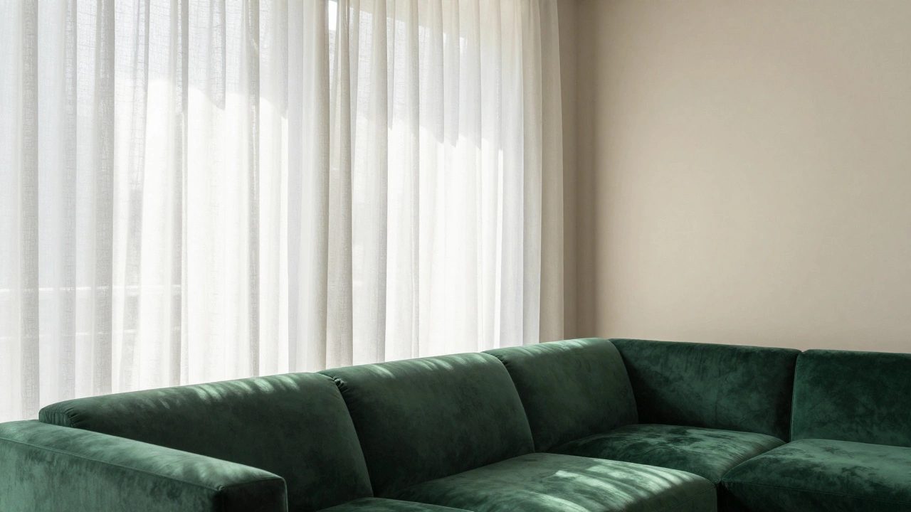
Curtains aren’t just for blocking light. They frame windows, control airflow, absorb sound, and anchor a room’s visual weight. If your curtains clash or disappear entirely, the whole room feels off-balance. Too many people think matching means copying-like picking the exact shade of your couch or wall. That’s not how color works in real life. It’s about harmony, not repetition.Think of it like this: your walls are the canvas. Your furniture is the main subject. Curtains? They’re the frame. A good frame doesn’t have to match the painting-it needs to complement it.
When to Match Curtains to Wall Color
Matching curtains to your wall color works best when you want to create a calm, seamless look. This approach is common in minimalist, modern, or Scandinavian interiors.Use this strategy if:
- Your walls are neutral-white, beige, light gray, or soft taupe
- You want the room to feel larger or more airy
- You have bold furniture or artwork that’s already the focal point
- You’re working with a small space and need to reduce visual clutter
For example, if your walls are a warm off-white like Benjamin Moore’s White Dove, choosing curtains in the same hue makes the window blend into the wall. The result? A clean, unbroken line that draws the eye upward and makes ceilings feel higher.
Pro tip: Go a shade lighter or darker than the wall. A 10-15% difference in tone adds depth without breaking the harmony. A wall in Revere Pewter (a gray-beige) looks richer with curtains in Simply White-subtle, but intentional.
When to Match Curtains to Furniture
Matching curtains to your furniture brings cohesion to the room’s main seating area. It’s especially useful when your sofa or armchairs are a standout color or pattern.Use this strategy if:
- Your sofa is a deep navy, emerald green, or mustard yellow
- Your walls are neutral or busy (like wallpaper or textured plaster)
- You want to tie the seating area together visually
- You’re working with a cozy, layered style like traditional or boho
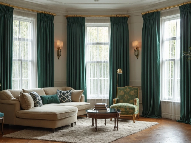
Imagine a living room with charcoal gray walls and a rich teal sofa. Curtains in the same teal pull the eye down to the seating area and make the space feel grounded. It’s not about exact matches-try a slightly muted or textured version of the sofa color. A linen curtain in teal-gray works better than a shiny satin in pure teal.
This method also helps if you have multiple pieces of furniture in different colors. Pick the most dominant one-the sofa, usually-and match curtains to that. It gives the room a clear visual anchor.
What If Neither Matches?
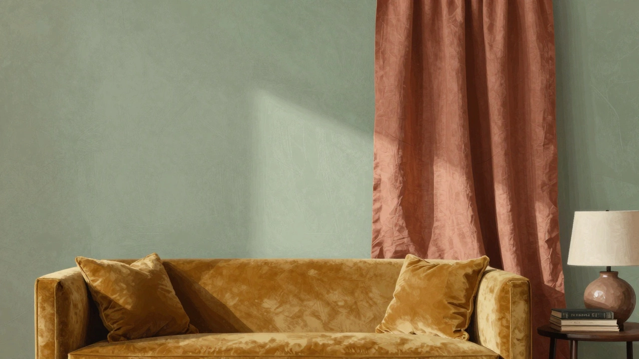
You don’t have to choose between wall or furniture. In fact, many of the most stylish rooms do neither.Instead, pick a third color that connects both. This is called the triadic harmony approach. For example:
- Walls: Warm gray
- Sofa: Burnt orange
- Curtains: Deep mustard or rust
Here, the curtains don’t copy either, but they sit between them on the color wheel. They bridge the gap. This works especially well in rooms with lots of texture-like wool rugs, wooden floors, or ceramic lamps. The curtains become a unifying thread.
Another option: go neutral. Cream, oat, or soft gray curtains work with almost any wall or furniture combo. They’re safe, but not boring. A well-chosen neutral has depth. Look for fabrics with subtle variation-linen with slubs, cotton with a weave pattern, or a lightly mottled dye.
Texture and Pattern Can Break the Rules
Color isn’t everything. Texture and pattern often matter more.Take a room with pale blue walls and a dark brown leather sofa. Matching curtains to either would feel heavy. But what if you hung sheer, white linen curtains with a subtle stripe? The lightness balances the dark sofa, and the texture adds movement. The wall color is still visible, the sofa still stands out-and the curtains? They breathe.
Patterns can also do the work for you. A curtain with a small geometric print that includes both your wall color and your sofa’s accent hue creates connection without matching. Think of it like a visual handshake.
Just avoid busy patterns if your walls or furniture are already patterned. Too much noise = visual chaos.
Lighting Changes Everything
Color looks different in morning light versus afternoon sun. In Wellington, where skies shift fast, this matters more than you think.Hold your curtain swatch up to the window at different times of day. Does it look gray in the morning? Yellow at 4 p.m.? That’s not a flaw-it’s real life. A curtain that looks perfect in the store might turn muddy in your living room.
Also, consider how much light you want. Light-colored curtains let in more sun, which brightens walls and furniture. Darker curtains absorb light and make a room feel cozier-but they can make pale walls look dull. If your room gets little natural light, avoid dark curtains unless they’re paired with bright walls.
What About Blackout Curtains?
If you need blackout curtains for sleep or TV viewing, don’t sacrifice style. You can still make them work with your design.Look for blackout liners with a decorative outer layer. Many brands now offer blackout curtains in linen weaves, textured cottons, or even velvet. Choose a color that fits your room’s palette-not just what’s on sale.
Blackout curtains in charcoal work beautifully with gray walls and a navy sofa. In a bedroom with white walls and a light wood bed, a soft taupe blackout curtain keeps things calm without looking clinical.
Quick Decision Guide
Still unsure? Use this flow:- Is your wall color bold or busy? → Go with furniture-matching curtains
- Are your walls neutral? → Match curtains to wall color for calm, or pick a neutral
- Is your furniture the star? → Match curtains to it
- Is your room small? → Light curtains, same tone as wall
- Do you have lots of patterns? → Stick to solid, neutral curtains
- Do you want drama? → Pick a curtain color one step deeper than your sofa
Real-World Examples
In a Wellington apartment with white plaster walls and a dark oak dining table, the owner chose oat-colored linen curtains. The result? The walls felt taller, the wood tones warmed up, and the curtains didn’t compete with the view of the harbor outside.Another case: a living room with sage green walls and a mustard velvet sofa. Curtains in a muted terracotta tied the two together without matching either. The room felt layered, intentional, and alive.
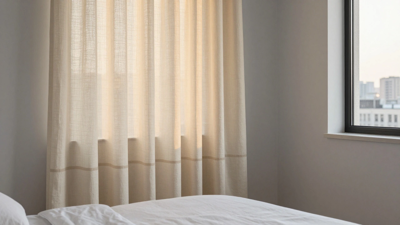
One more: a bedroom with pale gray walls and a white bed. Curtains in a soft cream with a barely-there stripe made the space feel luxurious-not flat. The stripe picked up the thread of the duvet cover. No one noticed it was intentional-until they asked.
Final Rule: Trust Your Gut, Then Test It
There’s no perfect formula. But there’s a simple test: lay your curtain swatch next to your wall and your sofa. Step back. Squint. Which one feels more natural? Which one makes the room feel complete?Don’t overthink it. If you walk into the room and feel calm, not confused-you got it right.
Do curtains have to match the sofa exactly?
No. Exact matches often look stiff or cheap. Instead, choose a curtain color that complements the sofa-like a shade lighter, darker, or a tone from the same color family. Texture and fabric type matter just as much as color.
Can I use patterned curtains with patterned furniture?
It’s possible, but risky. If your sofa has a bold print, stick to solid curtains. If both are subtle-like a small floral sofa and a striped curtain-make sure they share at least one common color. Avoid matching patterns exactly; that looks like a costume.
What if my walls and furniture are both bold?
Go neutral. Choose curtains in cream, oat, or soft gray. Let them act as a visual buffer between two strong elements. This prevents the room from feeling overwhelming. A neutral curtain doesn’t mean boring-it means balanced.
Should I match curtains in every room?
No. Each room has its own function and mood. Your bedroom might need calming neutrals, while your living room can afford a pop of color. Match curtains to the room’s purpose, not to each other.
Are blackout curtains ugly?
Not anymore. Modern blackout curtains come in linen, velvet, cotton, and even woven textures. You can find them in colors that blend with any decor. The key is choosing a finish that matches your room’s style-not just the darkest option on the rack.
How do I pick a curtain color if I’m not sure?
Start with a neutral that’s in your rug, pillow, or artwork. If you don’t have one, go with cream or light gray. These colors work with almost everything and let you change other elements later without redoing your curtains.
What to Do Next
Grab three curtain swatches: one that matches your wall, one that matches your sofa, and one neutral. Tape them to your window frame. Live with them for a day. Watch how the light changes them. Then ask yourself: which one makes you want to sit in the room longer?That’s your answer.