Cushion Color Combinator 2026
Choose Your Base
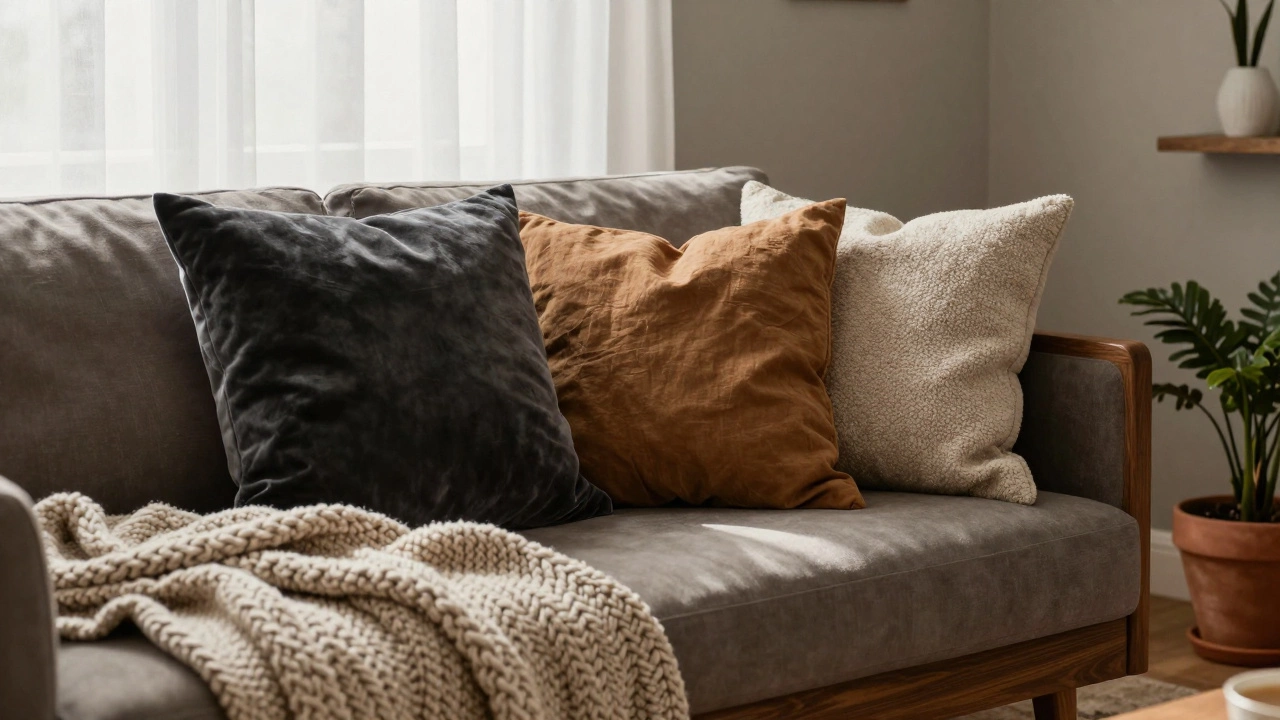
Your 2026 Cushion Combination
Base Cushion
Accent Cushion
Texture Cushion
This combination creates a layered, intentional look that feels calm and curated. The base color grounds the space while the accent adds depth without chaos.
How to Use This Combination
- Placement 1 base + 1 accent + 1 texture
- Textiles Natural fibers preferred
- Seasonal Use Year-round
When you walk into a home that feels just right, it’s often not the big furniture pieces that catch your eye-it’s the cushions. They’re the quiet rebels of interior design: easy to swap, cheap to replace, and powerful enough to completely change the mood of a room. In 2026, the question isn’t just what color cushions are in fashion, but how those colors make you feel when you sink into the couch after a long day.
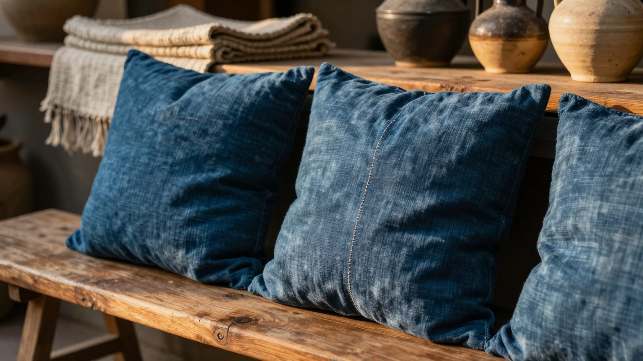
Earth Tones Are Still Winning, But They’ve Gotten Deeper
Last year, beige and warm greys dominated. This year, those same tones are still here-but they’ve grown up. Think terra cotta clay, deep moss green, and charcoal with a hint of rust. These aren’t the washed-out neutrals you saw in 2022. They’re rich, textured, and grounded. Designers in Wellington and Melbourne are pulling inspiration from the local landscape: the volcanic soil of the North Island, the rainforest undergrowth of Fiordland, the coastal cliffs of Kaikoura.
One real example: a client in Mt. Eden replaced her old ivory cushions with a set in burnt sienna and forest charcoal. She said, "It doesn’t look expensive, but it feels like it belongs." That’s the goal now-cushions that feel like they’ve always been there, not like they were bought from a catalog.
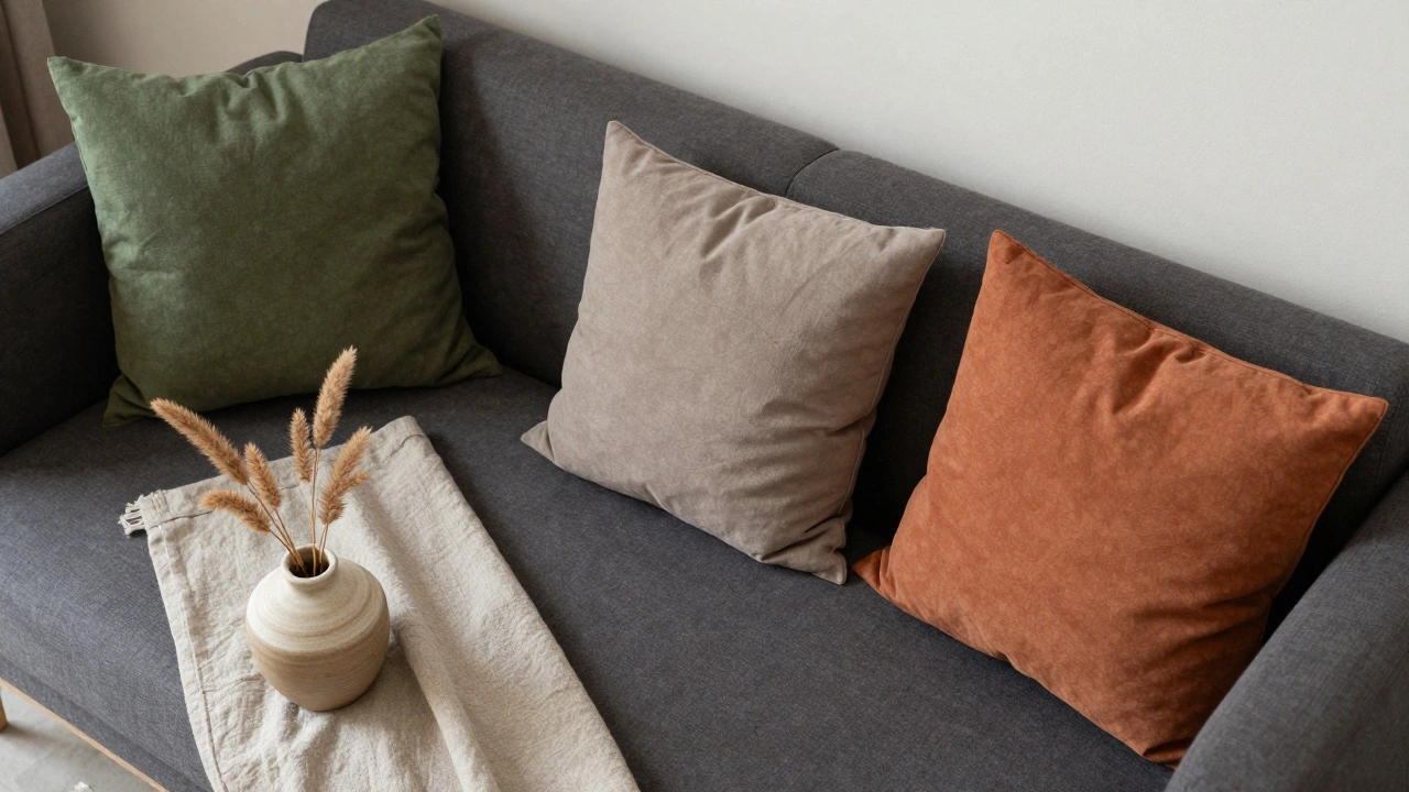
Unexpected Neutrals Are Stealing the Spotlight
White? Too sterile. Cream? Too predictable. The new neutral isn’t even neutral anymore. It’s oatmeal, slate taupe, or warm stone gray-colors that look like they were dyed with natural pigments, not factory dyes. These tones work because they don’t compete. They hold space. Pair them with a dark sofa and suddenly the room feels layered, not flat.
Look at the cushions at the new café in Te Aro: they’re not white, not beige, not gray. They’re a muted, slightly greenish taupe that matches the raw timber tables and the terracotta pots. It’s not trendy because it’s loud. It’s trendy because it’s calm.
Pop Colors Are Smarter Now
Remember when everyone threw in a bright yellow or electric blue cushion just because it was “on trend”? That’s over. In 2026, pop colors are intentional. They’re not accents-they’re anchors.
The standout shades this year? Indigo blue (not navy, not royal-something between the sky at dusk and a faded denim jacket), terracotta orange (the kind you find in old pottery), and deep mustard (not neon, not pale, but rich enough to make you pause).
A study by the New Zealand Interior Design Institute found that rooms with one or two cushions in these deep, saturated tones had 40% higher reported levels of relaxation among occupants. Why? Because these colors don’t shout. They hum. They’re comforting, not chaotic.
Texture Matters More Than You Think
Color isn’t just about hue. It’s about how light hits the fabric. A deep green velvet cushion looks nothing like a deep green linen one. This year, texture is the silent partner to color.
Woven bouclé in oatmeal is everywhere. Hand-loomed cotton in indigo is making a comeback. Knitted cushions with slight irregularities-imperfect stitches, uneven pile-are prized. They feel human. They feel alive.
One designer in Christchurch told me, "People don’t want perfect anymore. They want honest." That’s why you’ll see cushions that look like they were made by hand, even if they weren’t. The illusion of craft is the new luxury.
What Colors to Avoid
Not all colors are in. Some are officially out.
- Neon pink-too loud, too dated. It’s the 2010s trying to come back, and no one’s letting it in.
- Pastel lavender-it’s been overused in bedrooms and now feels tired, not tranquil.
- Pure white-unless it’s textured or slightly off-white, it looks like a hospital.
- Matching sets-five identical cushions in the same color? That’s not design. That’s a blanket order.
Even if a color is trending, if it’s used in a way that feels lazy or mass-produced, it won’t land. The key is intentionality.
How to Mix Colors Without Chaos
You don’t need to buy a whole new set. Start small.
- Keep your largest cushion-usually the one against the backrest-in a neutral like charcoal, oatmeal, or moss green.
- Add one cushion in a deep saturated color-indigo or terracotta works best.
- Finish with one or two in texture-only: bouclé, ribbed cotton, or linen with a subtle weave.
That’s it. Three cushions. No more. That’s enough to feel curated, not cluttered.
Try this combo: a charcoal sofa, one indigo cushion, one oatmeal bouclé, and one terracotta linen. Place them on a dark wood frame. Now step back. Does it feel calm? Does it feel like you could stay there all afternoon? That’s the test.
Where to Buy (and What to Look For)
Big-box stores still sell the same five colors they’ve had since 2020. If you want something that feels current, look locally.
- Check out small makers in Wellington’s Cuba Street or Auckland’s Ponsonby. Many use natural dyes and hand-weave their fabrics.
- Thrift stores are goldmines. Look for cushions with removable covers-you can reupholster them with modern fabric for under $30.
- Don’t ignore online artisans on Etsy or local platforms like Made in NZ. Search for "handmade cushions New Zealand" and filter by natural fibers.
Avoid anything labeled "trendy" or "seasonal." Those are the first to look outdated in six months. Look for words like "hand-dyed," "organic cotton," "natural pigment," or "slow-made."
Seasonal Shifts? Not Really
Forget the idea that you need lighter colors in summer and darker in winter. In 2026, the trend is year-round depth. A moss green cushion looks just as good in January as it does in July. The difference? How you layer it.
In summer, pair your deep cushions with lighter throws-linen, bamboo, or cotton. In winter, add a chunky knit blanket on top. The cushions stay the same. The feeling changes.
This isn’t about changing with the seasons. It’s about creating a space that feels steady, no matter what’s happening outside.
Final Thought: It’s Not About Color. It’s About Feeling.
What makes a cushion fashionable isn’t the Pantone code. It’s whether it makes you breathe easier. Whether you want to curl up with a book when you see it. Whether it feels like it was made for your hands, your couch, your life.
The best color for your cushions isn’t the one everyone else is buying. It’s the one that feels like home when you touch it.
What are the most popular cushion colors in 2026?
The most popular cushion colors in 2026 are deep earth tones like burnt sienna, forest charcoal, moss green, and indigo blue. These are paired with textured neutrals like oatmeal, slate taupe, and warm stone gray. Bright pops are gone; instead, saturated but muted tones like terracotta orange and deep mustard are used intentionally to ground a space.
Should I buy matching cushion sets?
No. Matching sets look mass-produced and dated. In 2026, the trend is curated asymmetry: one bold color, one neutral texture, and one grounding tone. Mixing different fabrics and shades creates depth and feels more personal.
Are white cushions still in style?
Pure white cushions are out unless they’re textured or slightly off-white. Cream, oatmeal, or warm stone gray are preferred because they feel softer and more lived-in. White looks sterile next to today’s richer tones and natural textures.
What fabrics are trending for cushions in 2026?
Hand-loomed cotton, bouclé wool, linen, and textured weaves are leading. Natural fibers are favored over synthetics. Look for subtle imperfections-slightly uneven stitching or uneven dye-as signs of craftsmanship. Velvet is back, but only in deep, muted tones.
How many cushions should I put on my sofa?
Three is the sweet spot: one large neutral (like charcoal or oatmeal) as the base, one in a saturated color (indigo or terracotta), and one in a textured fabric (bouclé or ribbed cotton). More than that feels cluttered. Less feels incomplete.
Can I use the same cushions year-round?
Yes. In 2026, cushions are designed for permanence, not seasonal swaps. Instead of changing colors, change the throw blanket on top-linen in summer, chunky knit in winter. The cushions stay the same, but the feel of the room shifts naturally.