Carpet Color Matchmaker
Walk into any home renovation show or browse through a high-end interior design magazine in mid-2026, and you will notice a distinct shift. The era of stark, cool-toned minimalism is fading. Instead, warmth, texture, and organic hues are taking center stage. If you have been standing in an aisle wondering which carpet color to pick for your living room, you are not alone. The market has moved away from rigid rules about light floors needing dark rugs, or vice versa. Today, it is all about how the floor feels underfoot and how it connects with the rest of your decor.
The short answer to what is most popular right now? It is not one single shade, but a spectrum of warm neutrals. Beige, oatmeal, and soft greiges dominate the sales charts. However, the real story lies in why these colors are winning and how they fit into the broader aesthetic of modern homes. Let’s break down the current landscape of flooring trends so you can make a choice that stands the test of time.
The Rise of Warm Neutrals: Beige and Oatmeal
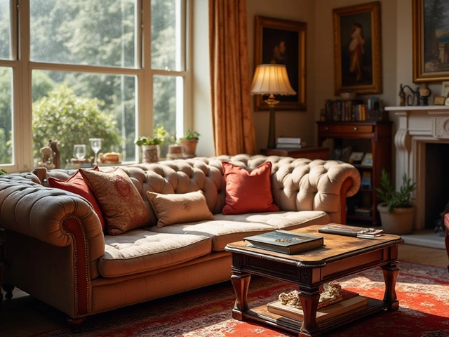
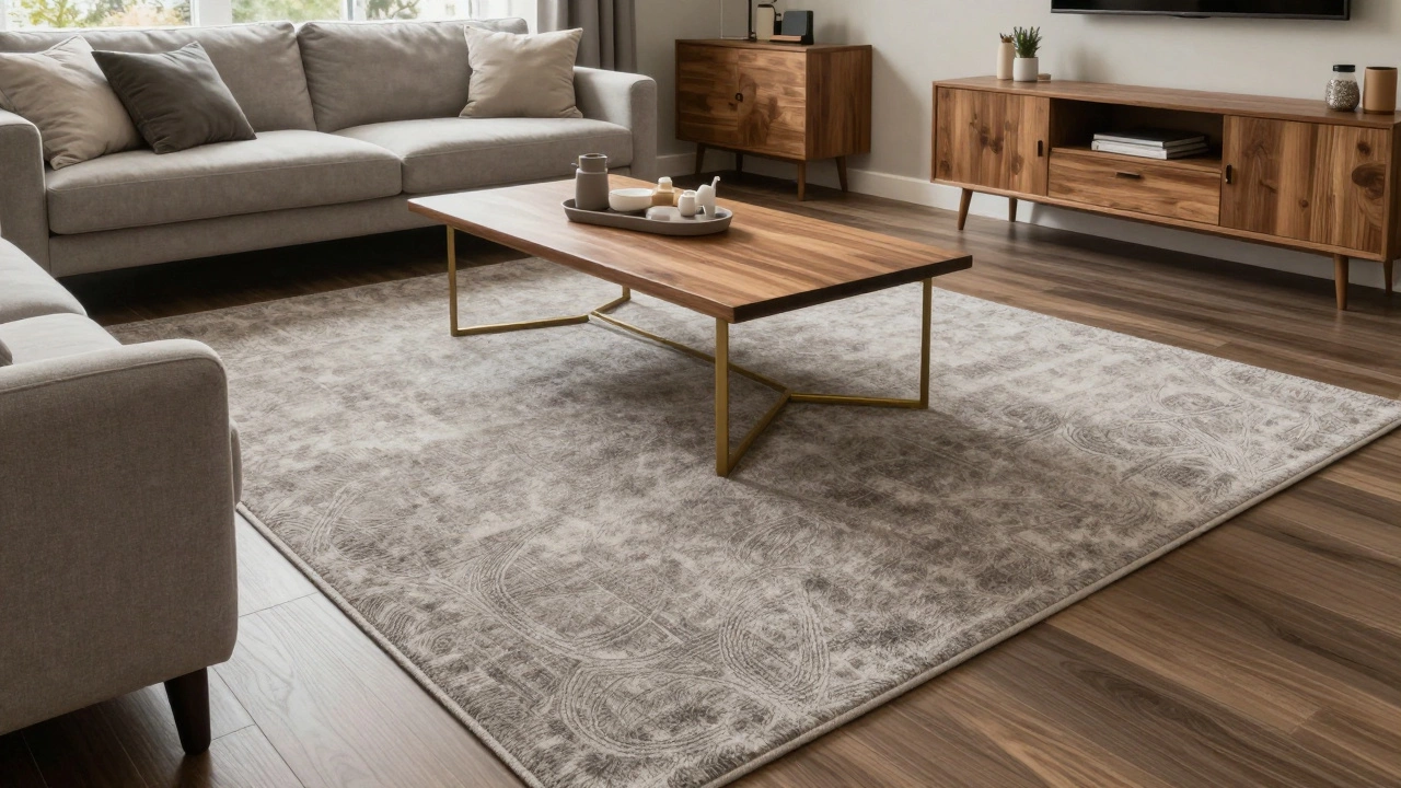
Beige and Oatmeal Carpets are currently the undisputed champions of popularity. These warm neutral tones provide a versatile backdrop that complements almost any furniture style, from mid-century modern to rustic farmhouse. Unlike the cold, sterile whites of previous decades, beige carries undertones of sand, clay, and wheat. This makes spaces feel inviting rather than clinical.
Why has beige made such a strong comeback? It comes down to flexibility. In 2026, homeowners are investing in pieces they plan to keep for years. A bright blue or emerald green rug might look stunning today, but it can become overwhelming as trends shift. Beige acts as a canvas. It allows your sofa, artwork, and throw pillows to take the spotlight. If you decide to repaint your walls next year, a beige carpet rarely clashes with the new palette.
Moreover, beige is incredibly forgiving when it comes to maintenance. We live our lives on our floors. Kids spill juice, pets track in dirt, and guests kick off muddy shoes. While no carpet stays pristine forever, lighter warm tones tend to hide everyday dust and lint better than dark charcoal or navy. Dust is naturally grayish-white; against a black carpet, it shows up immediately. Against an oatmeal hue, it blends in until vacuum day.
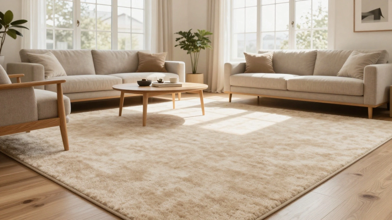
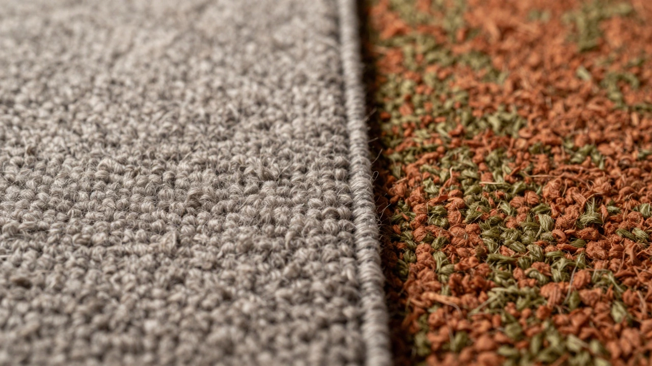
The "Greige" Phenomenon: Bridging Grey and Beige
If pure beige feels too traditional for your taste, you are likely looking at "greige." This hybrid color-part grey, part beige-has become the go-to compromise for designers and homeowners alike. Grey dominated the market from roughly 2015 to 2023, but many people found it too cold and industrial. Pure beige, while warm, sometimes felt dated or overly safe. Greige hits the sweet spot between the two.
Greige carpets offer the sophistication of grey without the chill. They pair beautifully with both warm wood tones and cool metal accents. Imagine a living room with walnut coffee tables and brass lighting fixtures. A cool grey rug might clash with the warmth of the wood. A yellow-beige rug might fight with the brass. Greige harmonizes with both. It provides a neutral ground that feels contemporary yet cozy.
When shopping for greige, pay close attention to the undertones. Some lean more towards taupe, while others hint at slate. Bring fabric swatches home and place them on your actual floor in different lighting conditions. Morning light often reveals cool undertones, while evening incandescent lighting brings out warmth. This simple step prevents the disappointment of buying a carpet that looks perfect in the store but wrong in your hallway.
Earth Tones: Terracotta, Olive, and Deep Blues
While neutrals rule the volume sales, there is a growing appetite for statement colors derived from nature. The biophilic design trend-bringing the outdoors inside-has pushed earth tones into the mainstream. You are seeing a surge in demand for terracotta, olive green, and deep indigo blues. These are not pastels; they are rich, saturated hues that add depth and character to a room.
Terracotta rugs bring a Mediterranean warmth to interiors. They work exceptionally well in open-plan living areas where the kitchen flows into the lounge. The reddish-brown tones mimic clay tiles and sun-baked earth, creating a grounded feeling. Olive green is another powerhouse. It connects visually with houseplants and natural wood furniture, reinforcing the connection to nature. Deep blues, particularly those inspired by denim or midnight skies, offer a calming contrast to warm wall colors like cream or pale yellow.
Choosing an earth-tone carpet requires confidence. Because these colors are bold, they dictate the mood of the room. A terracotta rug demands complementary accessories in creams, browns, and blacks. An olive rug pairs well with rattan, jute, and white linen. If you love these colors but fear committing to a full-wall installation, consider using them as area rugs rather than wall-to-wall carpeting. This allows you to enjoy the trend without being trapped by it if your preferences change in three years.
Texture Over Color: The Role of Pattern and Pile
In 2026, color does not exist in a vacuum. The texture of the carpet plays an equally critical role in how the color is perceived. A flat-weave sisal rug in beige looks completely different from a plush, high-pile wool rug in the same shade. The latter catches light and shadow, creating variations in tone that make the color appear richer and more dynamic.
Patterns are also making a subtle return, but they are understated. Instead of loud geometric prints, we see tonal patterns where the pile height varies slightly to create visual interest without introducing a second color. A beige carpet with a tonal diamond pattern adds complexity without clutter. This technique works wonders in large, open spaces that might otherwise feel empty or echoey. The visual noise of the pattern breaks up the expanse of floor, while the monochromatic scheme keeps the eye relaxed.
Material matters too. Natural fibers like wool, cotton, and jute have inherent color variations. No two strands of wool are exactly the same shade. This natural inconsistency adds authenticity and charm to earth-tone carpets. Synthetic fibers, while durable and stain-resistant, can sometimes look too uniform and plastic-like if not carefully manufactured. When prioritizing aesthetics, natural fibers often win on depth and richness.
Practical Considerations: Lifestyle and Longevity
Trends are exciting, but practicality must guide your final decision. Your lifestyle dictates which carpet color will survive daily wear and tear. Do you have dogs with dark fur? Dark hair sheds noticeably on light carpets. Conversely, light-colored dog hair stands out on dark floors. In this case, a medium-toned greige or a patterned carpet that disrupts the visual field might be your best friend.
Consider the foot traffic in the area. High-traffic zones like hallways and stairs need carpets that hide scuff marks and soil accumulation. Lighter colors show dirt quickly, requiring more frequent cleaning. Darker colors show lint and pet hair. Medium neutrals strike a balance. They do not show every speck of dust, nor do they highlight every strand of fur. For families with young children, stain resistance is paramount. Many modern synthetic carpets come with advanced stain-guard treatments that allow you to choose a lighter color without fearing permanent damage from spills.
Lighting is another crucial factor. North-facing rooms receive cooler, indirect light. In these spaces, warm beige or terracotta tones can counteract the chill, making the room feel cozier. South-facing rooms bask in bright, direct sunlight. Here, cooler greiges or soft blues can prevent the space from feeling overheated visually. Always test samples in the actual room during different times of the day. What looks balanced at noon might appear washed out at dusk.
Comparison of Top Carpet Colors for 2026
| Color Family | Best For | Maintenance Level | Vibe/Aesthetic |
|---|---|---|---|
| Beige/Oatmeal | Small spaces, light rooms | Medium (shows dust) | Airy, spacious, clean |
| Greige | Living rooms, offices | Low-Medium | Modern, sophisticated, balanced |
| Terracotta/Olive | Statement areas, dining | Low (hides stains) | Warm, organic, bold |
| Charcoal/Navy | Home theaters, bedrooms | High (shows lint/hair) | Dramatic, cozy, intimate |
How to Choose the Right Carpet Color for Your Home
Selecting the perfect carpet color involves more than just picking a favorite shade. Start by assessing your existing fixed elements. Look at your cabinetry, countertops, and built-in shelving. If you have dark wood cabinets, a light beige or greige carpet creates necessary contrast. If your kitchen features white quartz counters, an earth-tone rug adds warmth and prevents the space from feeling sterile.
Next, consider the size of the room. Lighter colors reflect light, making small rooms feel larger and airier. Darker colors absorb light, creating a sense of intimacy and enclosure. For a cramped apartment, sticking to light neutrals can trick the eye into perceiving more space. For a vast, echoing mansion, darker or textured rugs help define zones and add coziness.
Finally, think about longevity. Will you still love this color in five years? Ten years? Trends cycle, but classic neutrals endure. If you crave color, use your carpet as a neutral base and inject personality through movable decor like cushions, throws, and art. This strategy gives you the freedom to update your style seasonally without ripping up your floors.
Is grey carpet still in style in 2026?
Pure cool grey is losing popularity, having been replaced by warmer alternatives. However, "greige" (a mix of grey and beige) remains very trendy. If you love grey, opt for shades with warm undertones or incorporate it through texture rather than solid color blocks.
What is the best carpet color for hiding dirt?
Medium-toned greiges and patterned carpets are best for hiding everyday dirt. Solid light colors show dust and pet hair, while solid dark colors show lint and scuff marks. A multi-tonal weave or a subtle pattern disrupts the visual field, making soil less noticeable.
Should I match my carpet color to my walls?
Generally, no. Contrast is key for visual interest. If your walls are light, a slightly darker carpet grounds the room. If your walls are bold or dark, a lighter carpet prevents the space from feeling cave-like. Aim for harmony, not exact matching.
Are earth-tone carpets difficult to decorate around?
Not necessarily. Earth tones like terracotta and olive are versatile because they connect with natural materials. Pair them with wood, rattan, linen, and plants. Use neutral textiles like white or cream to balance the richness of the rug color.
How does lighting affect carpet color choice?
Lighting dramatically shifts how colors appear. North-facing rooms benefit from warm tones to counteract cool light. South-facing rooms handle cooler tones better to avoid overheating the visual space. Always view carpet samples in the actual room at different times of day.