Mar 4, 2025
Discover the Most Common Bedding Type
When working with curtain color ideas, the art of picking hues that enhance a room while managing light and privacy. Also known as window drape color inspiration, it blends style with function. Pair this with interior design, the overall aesthetic of a space, from furniture to finishes and you’ll see how each element talks to the others. Add light control, the ability of curtains to filter, block, or diffuse sunlight into the mix, and the picture becomes clear: your color choice directly influences mood, energy use, and visual harmony.
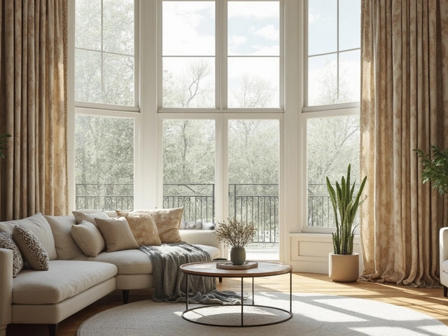
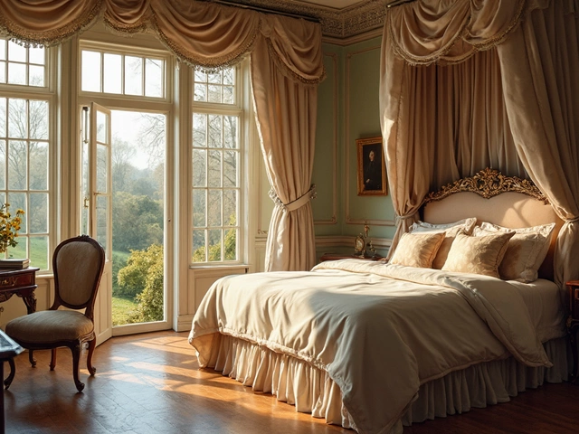
First, think about the wall color. A light‑neutral wall lets bold curtain shades pop, while deep walls invite softer, muted drapes that create contrast without overwhelming. For example, charcoal walls paired with mustard curtains add a modern twist, whereas cream walls with navy drapes feel classic and calming. Next, consider fabric type. Heavy fabrics like velvet absorb light, so lighter pigment can keep a room bright; lighter fabrics such as linen let more daylight in, meaning darker hues can still feel airy. The fabric choice also affects texture, and texture signals style – a smooth silk versus a rough burlap will shift the perceived warmth of the same color.
Light control is another driver. If you need blackout performance for a bedroom, you’ll gravitate toward darker shades or blackout linings, regardless of decor theme. In a living area where sunlight is welcome, sheer fabrics in pastel tones soften glare while echoing the room’s palette. Seasonal trends add a layer of decision‑making: spring favors fresh greens and soft pinks, while autumn calls for earthy terracotta and deep olive. These trends intersect with interior design styles – a mid‑century modern lounge often looks best with teal or mustard drapes, whereas a farmhouse vibe thrives on sage or rust tones.
Finally, think about the functional role of the room. A home office benefits from curtains that reduce glare on screens, so medium‑tone neutrals with a subtle pattern work well. A dining room, meant for conversation, can handle richer colors that invite appetite and ambiance. By mapping curtain color ideas to wall paint, fabric choice, light control, seasonal trends, and room function, you create a cohesive plan that feels intentional rather than accidental. Below, you’ll find a curated list of articles that walk you through each of these angles, give real‑world examples, and provide step‑by‑step tips to bring your perfect curtain palette to life.
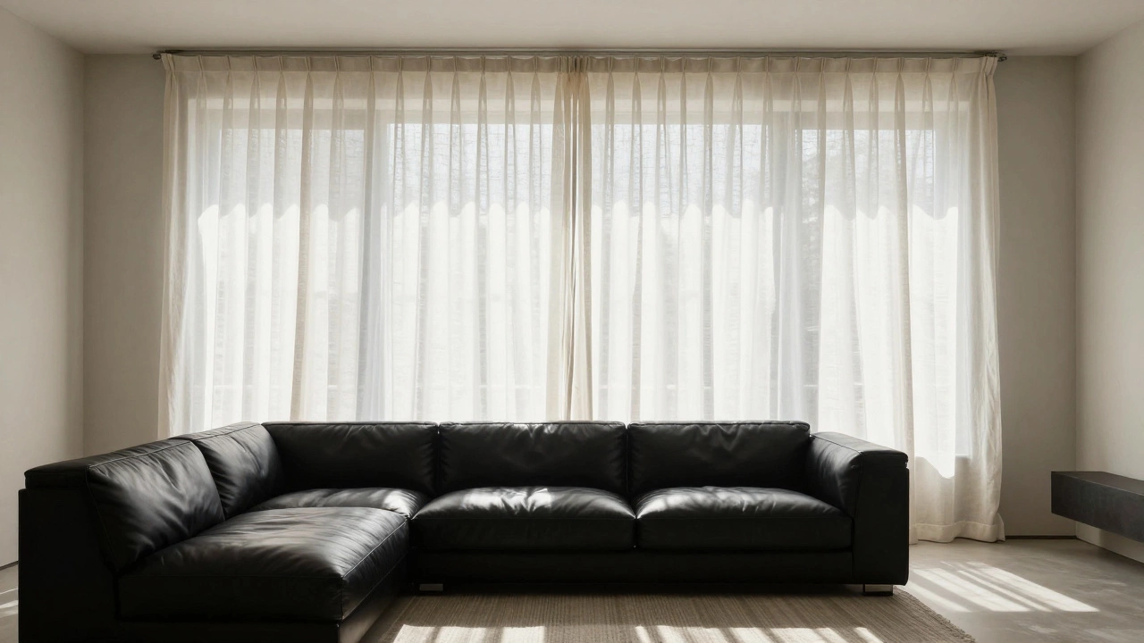
Choosing between lighter or darker curtains than your couch isn't about rules-it's about mood. Light curtains open up small spaces; dark curtains add depth to bright rooms. Learn how to balance color, texture, and light for a cohesive look.
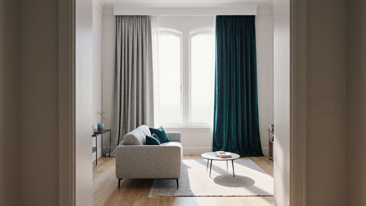
Discover when to match or contrast curtains with your sofa, step‑by‑step colour tips, texture tricks, and a handy decision table for a cohesive living room.