When you walk into a living room, the first thing you notice is how the pieces work together. If the Curtains are a fabric window treatment that controls light, adds privacy, and contributes to the room’s visual balance clash with the Sofa is a large upholstered seating piece that anchors the living space and sets the tone for comfort and style, the whole effect can feel off. But does that mean curtains must always be the same shade as the sofa? Not necessarily. Below you’ll find a step‑by‑step guide, real‑world examples, and a quick decision matrix to help you decide when to match, when to contrast, and how to keep the look intentional.
Key Takeaways
- Matching curtains and sofa creates a cohesive, serene backdrop, especially in minimalist or monochrome rooms.
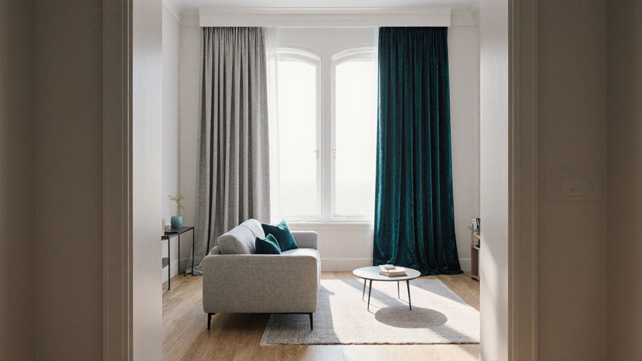
- Contrasting curtains add drama and can highlight architectural features, but they need a unifying Color palette is a planned range of hues and tones used throughout a space to create harmony to avoid visual chaos.
- Follow a three‑step colour‑selection process: (1) Identify the dominant hue, (2) Choose a supporting tone, (3) Test under real lighting.
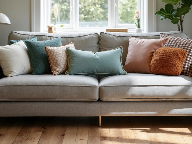
- Texture and pattern matter as much as colour; pairing a smooth linen curtain with a plush velvet sofa can create depth.
- Budget‑friendly tricks-like swapping curtain ties or adding a simple valance-let you experiment without replacing the entire window treatment.
Why Coordination Matters
Human brains look for patterns. When colours and materials repeat, the room feels stable and welcoming. In contrast, mismatched elements can cause a subconscious sense of unease, even if each piece is attractive on its own. The Interior design style is a consistent aesthetic approach-like modern, rustic, or coastal-that guides choices of furniture, finishes, and accessories you adopt will dictate how strictly you need to coordinate. A Scandinavian space thrives on muted tones and soft contrasts, while a Bohemian room celebrates bold mixes.
Matching vs. Contrasting: The Decision Matrix
Rather than asking "should they match?" ask "what mood are you after?" Below is a quick table that outlines the visual impact, ideal room types, and potential pitfalls of each approach.
| Aspect | Match (Same Color) | Contrast (Different Color) |
|---|---|---|
| Visual Effect | Unified, calm, seamless | Dynamic, focal point, layered |
| Best for | Minimalist, monochrome, small rooms | Large spaces, statement walls, eclectic styles |
| Risk | Can feel flat if texture isn’t varied | May look chaotic without a guiding palette |
| Typical Materials | Neutral linen, soft cotton, subtle sheers | Bold prints, rich velvets, contrasting textures |
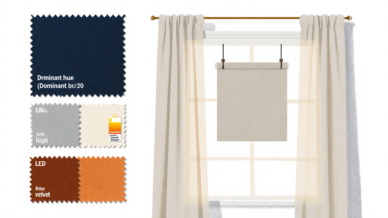
Three‑Step Colour‑Selection Process
- Identify the dominant hue. Look at the sofa’s upholstery. If it’s a deep navy, that’s your anchor colour. Write it down.
- Choose a supporting tone. Pull a colour from the room’s Paint color is a the specific hue applied to walls, ceilings, or trim that influences overall ambience or a piece of artwork. A muted gray, a soft ivory, or even a complementary shade like burnt orange can work.
- Test under real lighting. Hang a fabric swatch near a window at different times of day. Room lighting is a natural or artificial illumination that changes colour perception throughout the day will shift the hue dramatically; a colour that looks perfect at noon might appear too cool at dusk.
When you’ve confirmed the pair works, you’ll know whether you’re truly aiming for a match or a contrast. The key is that the decision feels intentional, not accidental.
Playing with Patterns and Textures
Sometimes the answer isn’t pure colour but pattern. A subtle herringbone curtain can echo a sofa’s tufted seams, creating a visual echo without being the exact same shade. Conversely, a bold geometric print can add excitement when the sofa is a solid colour.
Texture also adds depth. Pair a smooth cotton curtain with a velvety sofa for tactile contrast, or choose a linen curtain to mirror a linen‑blend sofa for a cohesive feel. Texture helps the eye distinguish elements even when colours are close.
Budget‑Friendly Ways to Experiment
You don’t need to replace the whole set of curtains to test a new look. Try these low‑cost hacks:
- Swap the curtain ties. Metallic rings, wooden clips, or rope tie‑backs can instantly alter the visual weight.
- Add a valance. A simple fabric panel at the top can bring in a new colour while keeping the original curtains.
- Use a fabric panel. Drape a decorative runner over the existing curtains for a pop of colour without a full replacement.
These tricks let you gauge how a colour works with your sofa before committing to a bigger purchase.
Common Pitfalls and How to Avoid Them
Pitfall 1: Over‑matching. If everything is the exact same shade, the room can feel flat. Introduce contrast through texture, pattern, or a third accent hue (think throw pillows or a rug).
Pitfall 2: Ignoring lighting. A bright white curtain may look crisp under daylight but appear washed out under warm LED lamps. Always test in the room’s primary lighting condition.
Pitfall 3: Forgetting the style cue. A sleek, low‑profile modern sofa paired with heavy, traditional drapes creates visual tension. Align the curtain style (e.g., grommet, rod‑pocket) with the sofa’s design language.
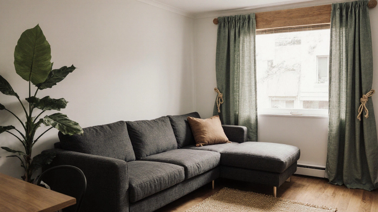
Real‑World Example: A Wellington Apartment
In a compact Wellington flat, the owner had a charcoal‑grey sectional and wanted a fresh look. They chose a muted sage‑green linen curtain, a hue pulled from a nearby houseplant. The curtain didn’t match the sofa, but it echoed the green in the entire colour palette (the rug, throw pillows, and a painted accent wall). The contrast created a focal point without overwhelming the modest space, and the added texture of linen softened the matte sofa upholstery.
Putting It All Together
Whether you decide to have curtains that curtains match sofa perfectly or opt for a thoughtful contrast, the process revolves around three core ideas: define a clear colour palette, test under real lighting, and balance colour with texture. When you treat the sofa and curtains as partners-rather than isolated items-the result feels intentional, stylish, and comfortable.
Frequently Asked Questions
Do I need to match the curtain colour exactly to the sofa?
Exact matches are not required. A close hue, a complementary tone, or a shared accent colour can create a cohesive look while still allowing visual interest.
What if I love bold prints but my sofa is solid?
Bold prints work well when the sofa’s colour appears in the pattern’s background or border. This ties the two pieces together without being overpowering.
How important is fabric texture in coordination?
Texture can bridge colour gaps. A smooth curtain paired with a plush sofa adds depth, while matching textures can reinforce a unified aesthetic.
Can lighting change the perceived match?
Absolutely. Natural daylight, warm incandescent bulbs, and cool LED lights each shift colour perception. Always check samples at the time of day you’ll most often use the room.
What’s a quick way to test a colour without buying new curtains?
Use a fabric swatch or even a large piece of colored paper. Tape it to the wall near the window, observe how it looks against the sofa, and adjust as needed.