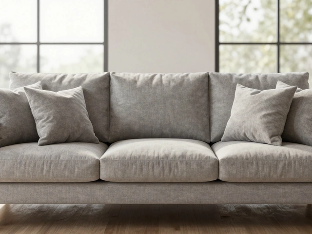
When it comes to designing your bathroom, the colors you choose for your accessories can transform the entire ambience, turning a mundane space into an inviting retreat. The spectrum of colors available offers endless possibilities for expressing your style and setting the mood.
From calming blues that evoke the gentle waves of the sea to earthy neutrals providing a grounding presence, each shade carries its own personality. The decisions you make here can turn your bathroom into a peaceful haven or a lively sanctuary.
In this guide, we'll explore the psychological impact of various hues, practical tips on selecting color schemes, and how to incorporate the latest trends to reflect your personal flair. Whether you're doing a full renovation or simply refreshing with some new towels and accessories, understanding the power of color can help you create the bathroom of your dreams.
- Understanding Color Psychology
- Classic Neutrals for Timeless Appeal
- Bold and Vibrant Choices
- Mixing and Matching Colors
- Personalizing with Seasonal Trends
Understanding Color Psychology
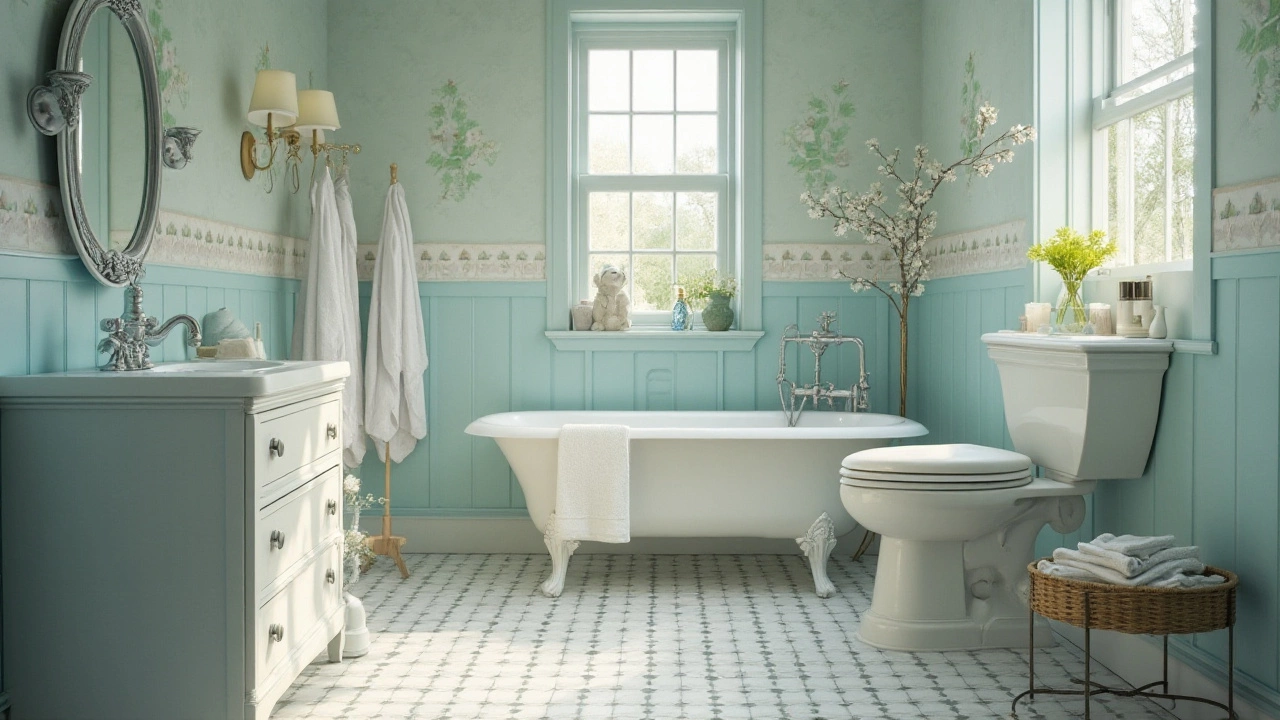
The study of color psychology delves deep into how different hues influence our emotions and perceptions. In spaces like the bathroom, where each moment can vary from a hurried morning routine to a leisurely evening unwind, the color palette becomes critical in setting the right tone. For instance, consider the calming nature of blues and greens. These shades are often associated with water, making them perfect for creating a serene environment reminiscent of the sea or a tranquil forest. Using these colors within your bathroom accessories can invoke a sense of peace and relaxation, transforming the space into a sanctuary.
On the flip side, bold reds and oranges can inject energy and warmth, sparking inspiration and enthusiasm as you start your day. However, caution is advised as too much intensity in a bathroom space might become overwhelming. A balanced approach, perhaps integrating softer tones through towels or countertop decor, can strike the perfect equilibrium. This intricate dance of color is why the psychology behind it is pivotal in interior design, offering subtle yet profound influences on human moods and behaviors.
Interior design isn’t merely about aesthetics; it’s about creating environments that cater to both the psyche and the senses. Many designers gravitate towards neutrals like creams and whites for their versatility, acting as blank canvases which can be easily tailored through accents and finishes. These shades provide a sense of cleanliness and simplicity, making spaces feel open and airy. A quote by Leatrice Eiseman, a well-known color specialist, perfectly captures this by stating:
"Color is a power which directly influences the soul."
But it’s not only about personal preferences; cultural connotations also play a significant role. Colors hold varying meanings across different cultures, affecting how individuals perceive them. For instance, while white is commonly associated with purity and cleanliness in many Western cultures, it may represent mourning in others. This adds another layer of complexity when choosing color schemes for your bathroom decor but also an opportunity to personalize your space inline with your own background and experiences.
To make informed decisions, consider experimenting with multiple color combinations right in the store or, using digital tools and apps that allow previews of how shades might pair together in your specific layout. You may even consider creating a color board using samples so that you can visualize exactly how different tones interact within your space. Colors are not just hues; they are an expression of identity, personal comfort, and aesthetic preferences coming together to create a uniquely personalized habitat.
Classic Neutrals for Timeless Appeal
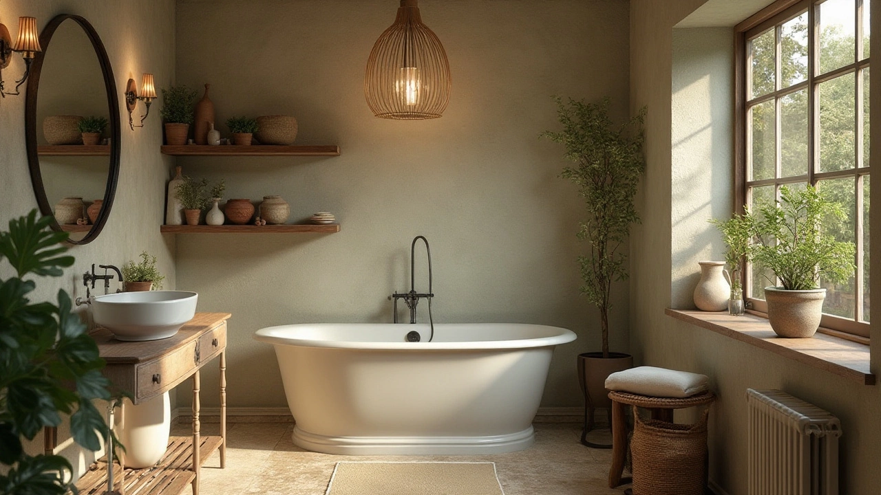
Neutrals stand as the epitome of elegance, crafting a canvas that is both soothing and versatile. When venturing into the world of bathroom accessories, the choice of neutrals becomes a gateway to timeless sophistication. The beauty of using shades like white, beige, gray, or taupe is their ability to gracefully complement any design theme, whether modern minimalism or rustic charm. Their understated nature provides a backdrop that can either stand alone in quiet confidence or be enhanced with subtle pops of color. Consider how a soft gray shower curtain can echo the hue of concrete or pebbles, adding texture and calming balance to your space.
"Neutrals are the staples of design. They don't scream for attention but whisper elegance," says interior designer Jane Lockhart.
But the allure of neutrals goes beyond mere aesthetics. Practicality reigns supreme with these hues. They deftly conceal minor splashes and streaks from daily use, requiring less frequent cleaning and maintenance. This feature is particularly appealing in a room that often endures the rigors of constant moisture and humidity. Moreover, neutral-colored bathroom accessories allow you to invest in quality pieces that will stand the test of time, both in durability and style. For instance, a taupe soap dispenser or ivory towel set transforms the mundane into the exquisite.
Pairing neutrals within a bathroom ensemble also invites the opportunity for layered textures. Imagine a sand-colored woven basket nestled under a sleek white vanity, holding plush gray towels that beckon you to unwind after a long day. The trick lies in blending different material qualities rather than varying colors. This harmonious melding of form and function means that your bathroom decor becomes a living testament to understated elegance. And should you wish to refresh the ambiance, changing out minor details like a bath mat or shower curtain in contrasting or complementary colors is seamless and cost-effective.
Ultimately, integrating classic neutrals in your interior design contributes to a serene environment where each element plays its role in achieving balanced harmony. By selectively choosing pieces that resonate both with your taste and practical needs, you create a space where elegance is perpetual. Whether you choose to imbue your space with modern metallic accents or keep it simple with clean white lines, the possibilities are endless. With neutrals, timeless appeal isn't just the goal; it's the reality.
Bold and Vibrant Choices
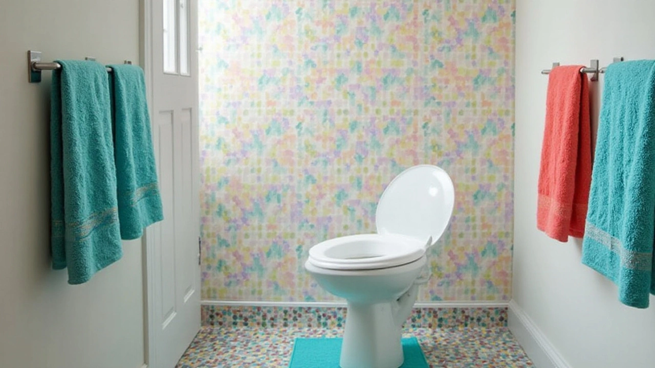
Embracing bold and vibrant colors in your bathroom can be an exhilarating design choice. These colors can inject life and energy into a space that’s often overlooked in terms of style. The robust reds, lush greens, and electric blues can turn your bathroom into a dynamic focal point of your home. When it comes to selecting bold colors, the key is to balance the intensity with thoughtful placement, ensuring the colors complement rather than overwhelm. One strategy is to choose a vibrant color for items such as towels, bath mats, or shower curtains. These accessories can be easily swapped out, allowing you to update the color scheme as trends change or your preferences evolve. Think about bold patterns or textures that can elevate the look without requiring a complete overhaul.
Consider the emotional impact vibrant colors can have. Red, for example, is associated with energy and passion, but it’s essential to use it sparingly to prevent overwhelming the senses. Similarly, yellow exudes happiness and cheerfulness but needs careful integration to avoid an overly stimulating environment. Meanwhile, blue, though vibrant in deeper hues, can invoke calm and serenity when used effectively. Using bold colors strategically can help you avoid overpowering the bathroom and instead create an energizing oasis. Remodeling reviews have noted that "a well-placed dash of color can transform a dull bathroom into a statement."
Moreover, the combination of vibrant colors with neutral backgrounds can create a beautiful contrast that highlights your bathroom accessories rather than clashes with them. Use neutral tiles or paint as a canvas, and allow your colorful accessories to pop with life. This balance also helps keep the bold colors from feeling too overpowering in more petite bathrooms. This approach is especially handy for anyone hesitant to commit to a drastic makeover while still indulging their love for colors.
Additionally, going bold doesn't always have to mean bright. For a modern twist, explore colors like deep emerald or navy. These hues are dramatic yet sophisticated, offering a refreshing spin on traditional interior design. Mixing vibrant colors with metallic accents can also add a touch of luxury to the space. Mirrors with gold or silver trims, brass faucets, or chrome features can bring an added shine that pairs beautifully with your chosen palette. Don't be afraid to experiment. Consider testing sample swatches in your bathroom to see how the colors interact with the space's lighting. Often, natural and artificial light can significantly influence how colors appear, and what seems vibrant under shop lights might change drastically in your home’s ambiance.
Lastly, remember that vibrant colors can go beyond walls and soft furnishings. Consider colorful finishing touches, such as a bright soap dispenser or a painted toothbrush holder. These small details build the color story in your decorescape and make the room feel cohesive. You can also introduce vibrant colors through bathroom decor items like framed prints or bold mosaic mirrors that make a statement. Vibrant art can lend an art-gallery feel to your bathroom, pulling together your color scheme while adding personality. With a few creative touches, your bathroom can easily be a testament to your bold design choices.
Mixing and Matching Colors
When it comes to bathroom accessories, mastering the art of color coordination can be the secret ingredient that transforms a space from drab to delightful. The key is balancing boldness with subtlety, harmony with contrast, to create a visually pleasing environment that meets your personal tastes. Before you start combining different hues, it’s imperative to consider the size of your bathroom. Smaller bathrooms benefit from lighter colors which can open up the space, so accessorizing with pastel color towels or white ceramic soap dishes might be ideal. On the other hand, larger bathrooms offer more flexibility to experiment with darker or more vibrant shades, inviting opportunities for rich patterns or statement pieces.
Color Schemes come in limitless options, but some combinations are tried and true. One fundamental approach is the rule of three: selecting a dominant color that covers around 60% of the space, a secondary color accounting for 30%, and an accent color for the final 10%. For example, in a bathroom with dominant white walls, consider a secondary color like ocean blue for bath mats and towels, with small pops of coral or golden accents through accessories such as soap dispensers or toothbrush holders. This creates a cohesive look where each element delivers a sense of purpose, guiding the eye smoothly across the room.
In mixing colors, textures also play a significant role. Matte finishes can lend a sophisticated touch, while glossy items might catch light, adding a sense of luxury to your decor. Mixing different textures can add depth to monochromatic schemes ensuring that the room doesn't feel flat or uninspired. For instance, pairing matte black hardware with glossy white ceramics can make for an eye-catching juxtaposition that simultaneously modernizes and softens your bathroom decor.
A bathroom should have a feel of comfort, a homely aura that comes from the right mix of colors and textures," says interior designer Jane Lockhart, who emphasizes the importance of aligning colors with personal moods and preferences.
Another dynamic concept is the use of complementary colors, which are opposing hues on the color wheel such as blue and orange or purple and yellow. When balanced correctly, these combinations can provide a lively aesthetic that energizes the space. But exercising caution with vibrant opposites is crucial, as overdoing it may overwhelm rather than invigorate.
Lastly, don’t overlook the potential seasonal shake-ups can offer your bathroom’s palette. Swapping out accessories in autumn hues or spring pastels allows for a refreshing change without the commitment of a full redo. Layering up colors seasonally keeps things fresh and ensures your bathroom reflects not just the trends, but how you currently feel most comfortable. Mixing and matching in a way that’s mindful of both space and seasons ensures your bathroom is always at its stylish best.
Personalizing with Seasonal Trends
Embracing seasonal trends in your bathroom can provide a delightful twist to your daily routine, making it feel like a fresh new experience every few months. As seasons change, so do the colors that are associated with them, bringing an opportunity to transform your space without undergoing a complete overhaul. Incorporating seasonal elements into your bathroom decor can be as simple as updating your bathroom accessories. Think about rustic shades of burnt orange for autumn, cool blues for winter, pastels for spring, and vibrant greens for summer. These hues can invigorate your space and match the mood of each season.
In autumn, swapping out your usual towels for deep auburn or goldenrod shades can mimic the changing leaves outside. You can add a plush bath mat in a similar tone or scatter decorative pumpkins around. Winter invites a cooler palette featuring frosted glass accessories, silver metallic elements, and icy blue towels or shower curtains. The cool tones naturally complement the chill outside, making your bathroom feel like a serene winter wonderland—a simple yet effective way of bringing winter inside.
The warmer weather of spring calls for lighter, more cheerful hues. Consider lively pastels like gentle pinks and yellows or cool mint greens. These colors can easily be introduced through soap dispensers, plant pots, or shower curtains. According to a
2019 report by the Color Marketing Group, "Color is a powerful tool used in design, providing cues to guide emotional responses and behaviors within a space."It makes spring a great time to refresh and revitalize. As we transition to summer, fresh and lively shades take center stage. Bold greens and aquatic blues remind us of nature and water, great for invigorating energy while keeping bathroom decor in tune with the lively outside environments.
While the shifts are subtle, they offer a wonderful visual change—enough to create a cozy, welcoming vibe during cooler months, and a light and airy escape during the warmer times. The beauty of seasonal color trends lies in their simplicity. Changing accessories is less of a commitment than repainting walls or replacing fixtures, and it allows you to easily match decorating themes found throughout the rest of your home.
If you're seeking inspiration for how to bring these ideas into reality, keep an eye on home decor magazines or visit online design platforms where trends are often shared and discussed. Additionally, many homeware stores adjust their collections based on seasonal colors, so you're likely to find exciting pieces that fit right in. Investing in a good set of accessories that suit different times of the year can make each season feel fresh and newly appreciated in the comfort of your bathroom.