Jun 12, 2025
Best Carpet Colors to Make a Room Look Bigger
Choosing the right curtain shade can feel like a guessing game, especially when you stare at a fresh coat of paint on the walls. The good news? You don’t need a designer’s eye to make it work. By understanding a few basic ideas about contrast, complement, and light, you can pick a combo that feels right the first time.
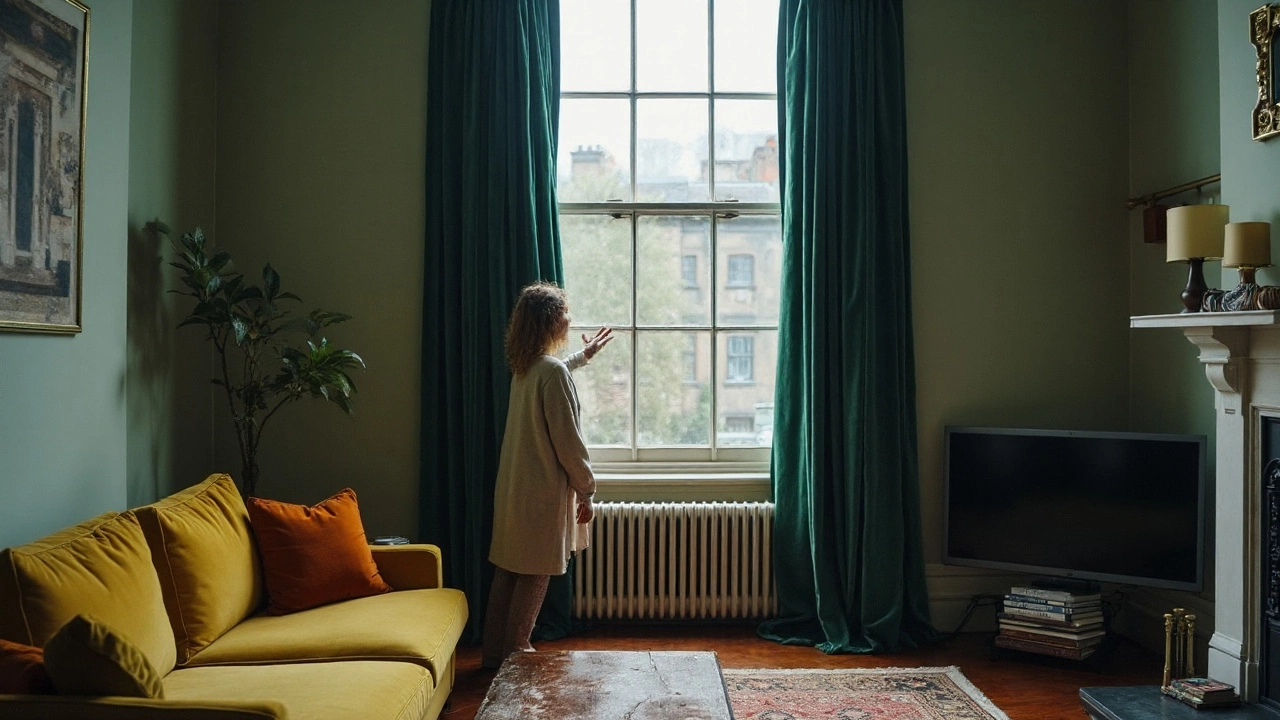
If you love bold statements, go for contrast. Dark curtains against light walls (or the other way around) create drama and draw the eye toward the windows. This works well in living rooms where you want a focal point. On the flip side, a complementary approach uses colors next to each other on the color wheel – like soft blue curtains with a muted teal wall. The result is a calm, cohesive vibe that doesn’t compete for attention.
One quick test: Hold a fabric swatch up to the wall. If the colors pop and you feel a little excitement, you’re probably in contrast territory. If they blend nicely and you get a relaxed feeling, you’ve landed on complement.
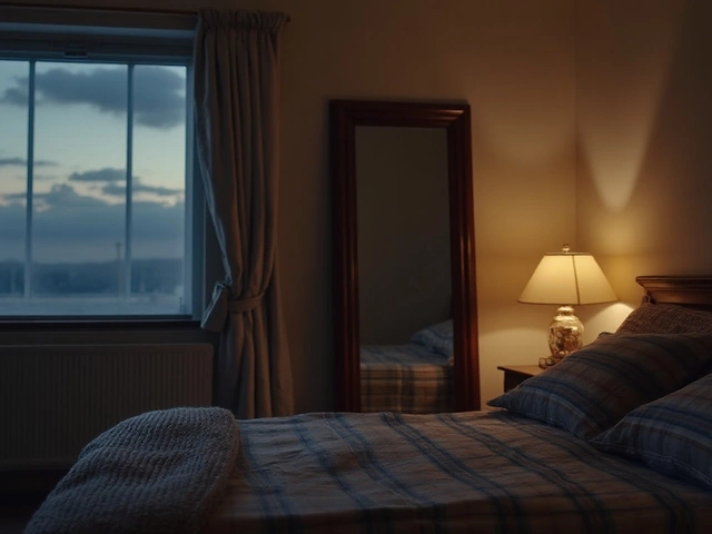
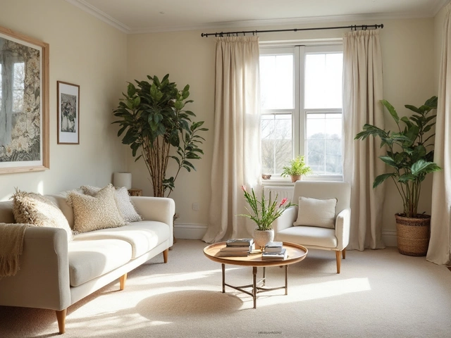
1. Start with the room’s purpose. Bedrooms benefit from soothing tones, so light neutrals on walls with pastel curtains keep the space restful. Kitchens and dining areas can handle more energy – think sunny yellows on walls paired with crisp white curtains.
2. Consider the amount of natural light. Bright rooms can handle darker curtains without feeling cramped. In low‑light spaces, choose lighter curtains to reflect what little light you have.
3. Match the undertones. A warm‑toned wall (think beige or warm gray) pairs best with curtains that have warm undertones, like rust or golden mustard. Cool walls (soft gray or blue) look best with cool curtains such as navy or sage.
4. Use the 60‑30‑10 rule. Let 60% of the room be the wall color, 30% be the curtain, and 10% be accent pieces (like cushions or artwork). This keeps the palette balanced and avoids overloading the eye.
5. Don’t ignore texture. A plain cement wall with heavy linen curtains adds softness, while a glossy paint finish can handle sleek satin drapes. Texture can make a simple color combo feel richer.
6. Test with samples. Paint a small patch on the wall and hang a curtain sample for a day. Watch how the colors shift from morning to evening. Small changes in light can totally alter the look.
Finally, trust your gut. If a pairing feels right when you walk into the room, chances are you’ve hit the sweet spot. Remember, there’s no one‑size‑fits‑all rule – experiment, have fun, and let your personal style guide the decision.
Wondering if curtains should be darker than your room? Learn when to go darker, lighter, or match your walls. Get clear rules, examples, and a quick cheat sheet.