Dark curtains can make a space feel luxe and grounded-or heavy and gloomy. Light curtains can look airy-or washed out and cheap. The real question isn’t “darker or lighter?” It’s “what vibe and function do you need in this room?” Here’s a clear way to decide, without second-guessing every swatch you bring home.
TL;DR: When should curtains be darker than the room?
- Go darker than the walls if you want contrast, drama, or you need more light control. Works best with light or mid-tone walls, good natural light, and higher ceilings.
- Go lighter than the walls if the room is small, low on light, or you want an open, breezy feel. Sheers layered over blackout works in bedrooms.
- Match (or stay within 1-2 shades of) the wall for a seamless, taller look-great for small rooms, low ceilings, or bold wall colours.
- Use a rule of thumb: aim for a 20-30 Light Reflectance Value (LRV) difference for crisp contrast; under 10 LRV difference for a subtle, calm look.
- Always test swatches on the actual window at morning, midday, and night. Sun direction changes everything (in NZ, north-facing rooms get the strongest sun).
How to choose the right curtain colour step by step
Job 1: Decide the role of these curtains. What do you need most right now-light control, privacy, insulation, sound softening, or a style statement? Bedrooms and street-facing windows usually want privacy and light control. Living rooms often need softness and shape without killing daylight. If thermal performance matters (hello Wellington southerly), choose a lined or thermal-backed fabric and decide colour second.
Job 2: Read your walls and light (LRV and direction). You don’t need a lab device-just get close:
- Look up your wall paint’s Light Reflectance Value (LRV) on the brand chart (Resene, Dulux NZ, etc.). If you can’t find it, estimate: bright white ~80-90, pale neutrals 70-80, mid greige 50-60, mid blues/greens 35-50, charcoal 10-20, black 0-5.
- Sun direction matters in the Southern Hemisphere: north-facing rooms are bright and warm; south-facing are cooler and dimmer; east gets crisp morning light; west glows golden late day. More sun can handle darker, heavier fabrics. Low light rooms prefer lighter tones or sheers.
Job 3: Pick your contrast strategy. Choose one of three paths:
- curtain color vs wall color (contrast for drama): If walls are light (LRV 70+), choose curtains 20-40 LRV lower (e.g., white walls with graphite or deep olive curtains). This frames the window and anchors the room.
- Light-on-dark (brighten a moody wall): If walls are dark (LRV <30), go lighter by 20-40 LRV (e.g., charcoal walls with oat or flax linen). This loosens the mood without fighting the paint.
- Tonal blend (almost match): Stay within 10 LRV of your wall. This elongates walls, makes ceilings feel higher, and looks calm-ideal for small rooms and rentals where you want polish without repainting.
Job 4: Mind undertones. Cool walls (blue, green, violet undertones) pair best with cool neutrals (grey, pewter, natural flax linen that leans cool). Warm walls (yellow, red, brown undertones) pair with warm curtains (oatmeal, caramel, terracotta). If you mix warm and cool, bridge them with a pattern that contains both.
Job 5: Choose fabric and lining for performance. Colour isn’t the only lever.
- Blackout backing: Blocks up to 99% of light. Great for bedrooms and night-shift sleepers.
- Thermal lining: Helps hold heat. The U.S. Department of Energy notes medium-coloured draperies with a white thermal backing can reduce heat gain by up to about a third in summer conditions. In NZ winters, good linings noticeably cut draughts.
- Face fabric: Linen blends drape softly; velvet looks rich and blocks more light; cotton twill is versatile; performance polyester resists fading and is easy-care; solution-dyed acrylic is top-tier for UV resistance (handy in high-UV regions like New Zealand-NIWA reports consistently high UV indices over summer).
Job 6: Decide proportions and pattern. Use 60-30-10. If your walls are the 60 (dominant), curtains can be the 30 (secondary) or 10 (accent) depending on how bold you want to be. A large-scale pattern reads darker from a distance; small patterns read lighter. Tonal patterns hide dust and lend depth without chaos.
Job 7: Sample properly (this is where most people go wrong).
- Order at least three swatches per option: one lighter, one mid, one darker than you think you want.
- Tape swatches on the window frame and let them overlap the glass edge. View them morning, midday, and evening with the room lights on and off.
- Stand back 3-4 metres. Colours shift with distance and shadow.
- Rub the swatch. If it pills or sheds, skip it. If you have pets, do a fur test.
Job 8: Hang them right. Colour reads better with good placement.
- Mount the rod 10-20 cm above the window and extend it 20-30 cm past each side so curtains can stack clear of the glass. Darker curtains need that stack-back or they’ll steal daylight.
- Make them wide: 2-2.5x the window width for fullness. Skim or break at the floor; puddling looks formal and collects dust.
- Choose a rod colour that supports the scheme (black or bronze for contrast; brass or pewter to soften; white to disappear).
Real-world examples and colour pairings that work
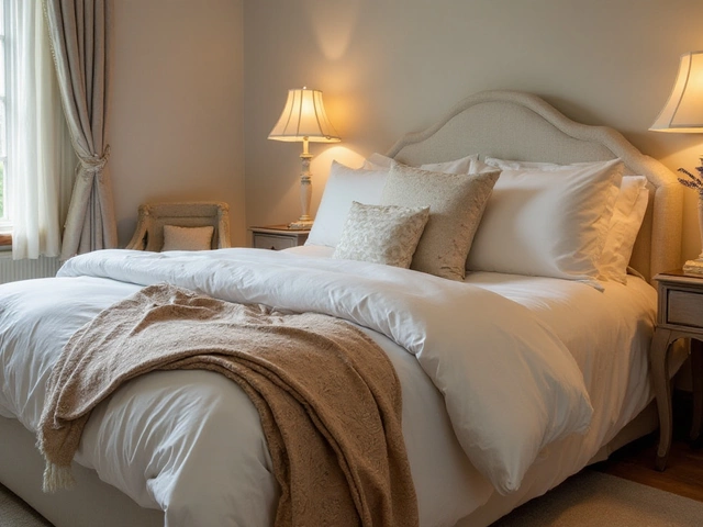
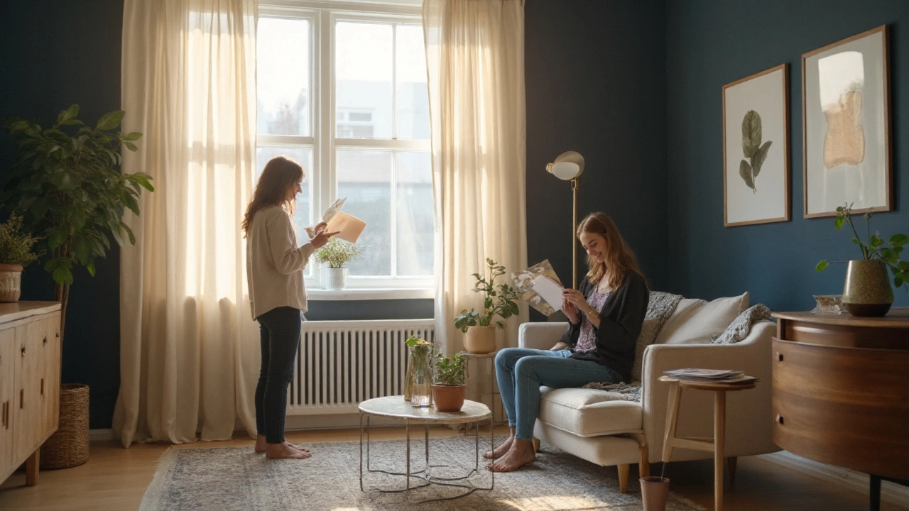
Light walls, need grounding and privacy: White or soft white walls (LRV 80-90) with charcoal, deep olive, or walnut-brown curtains. The dark fabric outlines the window and adds weight, which stops a bright space feeling sterile. In my sunny Wellington living room, deep olive velvet plus a white thermal lining gives me cosy evenings without killing that golden 4 p.m. light.
Mid-tone greige walls, calm and cohesive: Walls around LRV 50-60 (think Resene Sea Fog family) with oatmeal or flax linen. Add a faint herringbone texture to hide dust. This tonal match stretches the wall visually-great in small lounges or narrow bedrooms.
Sage walls, warm contrast: Soft green walls with terracotta or cinnamon curtains. Warm-on-cool feels collected and grown-up if you echo the tone in a cushion or rug stripe. Keep the curtain pattern low-contrast so it doesn’t fight the wall.
Navy walls, bright lift: Deep blue walls with natural linen or pale stone curtains. The lighter fabric stops the room from feeling heavy during winter. If you need blackout, add a separate track for a hidden lining so the face fabric stays light and pretty.
Charcoal walls, airy layering: Sheer white or ecru on the front, with a hidden blackout roller behind. By day you get filtered light; by night you get privacy. The light sheers soften a dark shell without repainting.
Kids’ rooms: Pastel walls with mid-tone patterned curtains. A simple dash print or micro-check hides stains and grows with the child. Use blackout lining so bedtime doesn’t argue with daylight saving.
Home office: If your walls are mid blue-grey, choose a slightly darker curtain in the same family for focus and screen glare control. Keep texture matte-shiny fabrics throw distracting hotspots.
Rentals: When you can’t paint, pick curtains within 1-2 shades of the existing wall. It always looks intentional, even if the wall colour isn’t your dream.
| Wall tone & approx. LRV | Recommended curtain tone | Visual effect | Light control | Watch-outs |
|---|---|---|---|---|
| Bright white (80-90) | Medium-dark (LRV 20-40) | Strong frame, adds warmth and depth | Excellent with lining | Can feel heavy in tiny rooms; extend rod for stack-back |
| Pale neutral (70-80) | Mid neutral or tonal pattern (40-60) | Balanced, polished, not flat | Good; add blackout in bedrooms | Check undertone match (warm vs cool) |
| Mid greige/grey (50-60) | Either lighter (60-70) or darker (30-40) | Choose mood: airy vs grounded | Moderate; add lining for privacy | Too-close match can look muddy if texture is flat |
| Colour mid-tone (35-50) | Tonal pattern within ±10 LRV | Calm, designer look | Depends on lining | Pattern scale: too small = busy, too big = blotchy |
| Dark (10-30) | Lighter neutral (40-70) | Lightens, breaks up heaviness | Good with separate blackout | High contrast shows dust; keep fabric wipeable |
| Very dark/black (0-10) | Light to mid (50-80) | Striking, gallery vibe | Use layered solutions | Mind glare on screens; choose matte fabrics |
Why darker can be smart: Dark curtains visually anchor tall rooms, hide old window frames, and cut glare on TVs. They also fade faster if unlined in harsh sun, and show lint. If you love them, line them-especially in NZ’s high-UV summers.
Why lighter can be clever: Light curtains expand tight spaces, let daylight bounce, and look fresh with natural textures. They show stains less than you’d think when you choose oatmeal, stone, or pale flax instead of pure white-and they’re safer in damp zones where heavy fabrics can feel clammy.
Cheat sheet, pitfalls to avoid, mini‑FAQ, and your next steps
Quick cheat sheet
- Small or dim room? Choose curtains lighter than the wall or within 1-2 shades.
- Big, sunny room? You can go darker than the wall for drama and control.
- Want it to feel taller? Match curtains to wall (±1-2 shades) and mount high.
- Grey walls? Pick curtains in the same warm/cool family, either 2-3 shades darker for contrast or 1 shade lighter for airiness.
- Strong wall colour? Use a tonal or low-contrast patterned curtain to avoid a fight.
- Harsh sun (north-facing in NZ)? Line everything. Use UV-stable fabrics.
Pitfalls to avoid
- Undertone clash: Cool grey walls with creamy yellow-beige curtains can look “dirty.” Match temperature first, then play with light/dark.
- Skimpy width: Dark curtains that don’t stack off the glass make rooms feel cramped. Always extend the rod and order enough fullness.
- Unlined darks: They’ll fade, especially near coasts with strong light. Add a white or ivory lining to reflect heat and protect the fabric.
- All-white sheers at street level: At night you’ll be on display. Layer with a roller or blackout track behind.
- Pattern panic: If your rug is bold, keep curtains solid or tonal. If your room is plain, curtains can carry a gentle pattern.
Mini‑FAQ
Should curtains be lighter or darker than walls? Neither is “right” in every case. Darker than the wall suits bright rooms, high ceilings, and when you want contrast or blackout. Lighter suits small or low-light rooms and a breezy feel. Matching the wall is a safe, designer move for a calm, taller look.
Can curtains match the wall colour exactly? Yes, especially in small rooms or with bold paint. It elongates walls and looks custom. Aim for the same hue with a slight texture shift so it doesn’t feel flat.
Do darker curtains make a room look smaller? They can if they cover glass in daylight or if the ceiling is low. Reduce that by stacking them off the glass and mounting the rod higher than the frame.
Will dark curtains fade faster? Yes, deep dyes absorb more UV. Use quality lining and UV-stable face fabrics (solution-dyed acrylic or polyester blends). Rotate panels yearly if one side gets harsher sun.
What colour curtains go with grey walls? Stick with the same undertone: cool greys pair with blue-grey, charcoal, or icy flax; warm greys pair with greige, taupe, or warm stone. Choose 2-3 shades darker for contrast or 1 shade lighter for softness.
Are black curtains a bad idea? Not automatically. In a large, bright space they’re striking and practical. In a small, dim room they’ll look heavy unless you’ve got serious daylight and generous stack-back.
Do curtains need to match the sofa or rug? No. They should harmonise. Let one element lead in tone and echo it softly elsewhere. If your sofa is dark, lighter curtains help balance; if your rug is pale, darker curtains can ground the room.
What about thermal performance? Lined curtains reduce heat loss in winter and heat gain in summer. The U.S. Department of Energy reports meaningful reductions in heat transfer with properly fitted, lined draperies. Snug tracks and floor-length panels matter as much as fabric colour.
Next steps (fast, no-regrets plan)
- Measure the window and decide hardware: rod 20-30 cm past each side, 10-20 cm above the frame. Note your wall paint name (for LRV lookup).
- Pick your strategy: darker for contrast, lighter for airiness, or tonal match for calm. Set a target LRV gap: 20-30 for strong contrast; under 10 for tonal.
- Order 6-9 swatches (three per strategy). Include one textured option (linen blend or slub) and one performance fabric for UV resistance.
- Test swatches on the window across three times of day. Remove any that shift green/yellow or look dull at night under your bulbs.
- Choose lining: blackout for bedrooms, thermal for lounges. In high sun, pick a white or ivory lining to reflect heat and protect colour.
- Confirm width for proper fullness (2-2.5x). If going dark, ensure enough stack-back to clear the glass.
- Install, then style: steam the hems, train the pleats for a week, and add one or two accents (cushion or throw) that echo the curtain tone.
Troubleshooting by scenario
- South-facing flat feels gloomy: Choose curtains lighter than the wall with a soft weave that catches light. Add a separate blackout roller if it’s a bedroom.
- Sun-baked lounge with glare: Go darker, textured, and fully lined. Consider a double track: sheer by day, blackout by night.
- Low ceilings: Match curtain colour to the wall and mount rods at ceiling height. Long, uninterrupted panels draw the eye upward.
- Busy open-plan space: Keep curtains neutral and tonal; let art or the rug hold the colour story.
- Rental with odd wall colour: Find the colour family and go 1-2 shades lighter or darker. Texture and lining will do the heavy lifting.
If you remember nothing else: decide the job, match undertone, pick your contrast level by LRV, and always test on the actual window. Do that, and darker vs lighter stops being a guess-and starts being a tool you control.