Jan 15, 2025
Elevating Your Bathroom Experience with Luxurious Accessories
Ever stare at a paint swatch and feel totally lost? You’re not alone. The good news is you don’t need an art degree to get colors right. A quick look at the color wheel, a few rules about warm and cool tones, and a handful of practical tricks can make any room feel purposeful.
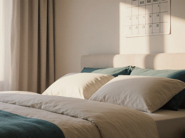
The color wheel splits into three primary shades – red, blue and yellow – that can’t be mixed from other colors. Blend two primaries and you get the secondary colors – orange, green and purple. When you pick a wall color, think about its opposite on the wheel – that’s the complementary hue. Pairing a soft teal wall with a few copper accents, for example, creates a natural pop without looking forced.
For beginners, stick to a 60‑30‑10 rule: 60% of the room gets a dominant color (usually the walls), 30% a secondary hue (think upholstery or rugs), and the remaining 10% is a bold accent (throw pillows, art, or a statement lamp). This balance keeps the space from feeling chaotic while still giving you room to play.
Warm colors – reds, oranges, yellows – tend to make a room feel cozier and can even make a sprawling living area feel intimate. Cool colors – blues, greens, purples – pull the eye back, making a cramped space appear larger. If your bedroom feels squat, try a pale sky‑blue on the walls and layer warm textures in your bedding to keep it from feeling chilly.
Lighting is the secret sauce. Natural light shows true color, while incandescent bulbs add a yellow tint and LEDs can swing either way depending on the temperature. Test your paint swatches at different times of day; a shade that looks perfect at noon might turn gray in the evening.
Another handy trick is the "one‑color‑down‑the‑wall" approach. Paint just the lower third of a wall a deeper shade and keep the upper two‑thirds neutral. It adds depth without overwhelming the eye, and works especially well in narrow hallways.
Don’t forget about accessories. Curtains, rugs, and cushions are low‑cost ways to experiment with color theory. A neutral sofa paired with a patterned rug that pulls in a complementary color can tie the whole room together without a paint job.
Finally, trust your gut. If a color makes you smile, it’s probably the right pick. Use the rules as a starting point, then tweak until it feels right for you. With these simple color theory basics, you’ll be able to mix, match, and style any room like a pro.
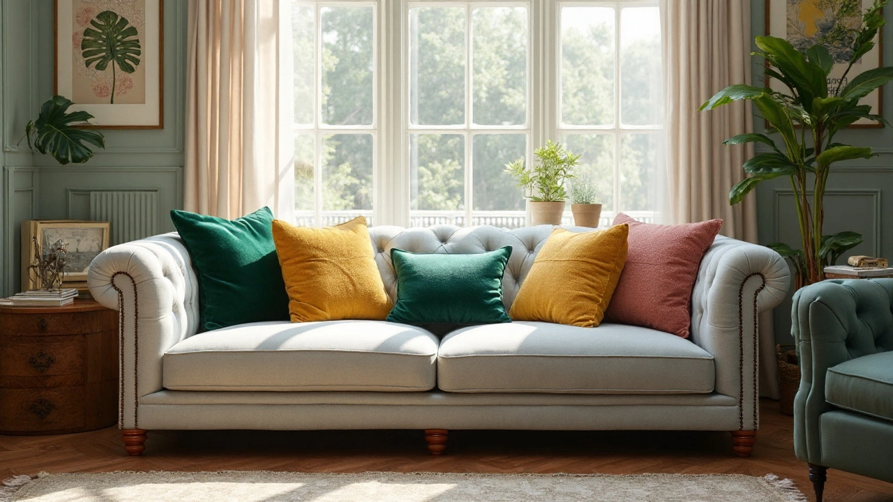
Unlock the secrets of cushion color pairings to make your living room pop. Discover how different shades and textures bring harmony, style, and coziness to your space.