If you’ve ever squinted at a pile of cushions, wondering why mixing those colors didn’t quite hit the vibe you pictured, you’re definitely not alone. Color choices can make or break how a room feels—the wrong combo creates visual clutter, while a smart mix can tie together everything in your living area, even those clashing hand-me-down chairs. Color theory isn’t just for painters and designers; it decides whether your space feels cozy and inviting or jumbled and awkward. So, if you’ve ever stood in a store aisle, cushion in each hand, asking yourself, “Does navy go with mustard or should I stick to safe beige?”—there’s actually a method to it, and it doesn’t have to be a guesswork game.
The Basics: Understanding Color Rules for Cushions
Color has moods. Even a tiny pop of the right shade can turn a lifeless couch into a scene right out of a designer’s Instagram feed. The big secret? Most gorgeous cushion arrangements come down to three main approaches: choosing colors from the same family, playing with contrasts, or sticking to a classic, timeless palette.
Start with the color wheel—it’s not just a graphic you saw in elementary school art class. The wheel is the go-to tool for figuring out what colors usually play well together. Colors next to each other, like teal and green, are called analogous—they’ll always get along. On the other hand, colors straight across from each other, like blue and orange, are complimentary and add a punchy, lively vibe.
Most interior designers swear by the 60-30-10 color rule. It’s dead simple: 60% is your main color (maybe your sofa or the walls), 30% is a secondary color (maybe a rug or big artwork), and 10% is your accent—where those interesting cushions come in. This rule keeps things looking intentional rather than like a color explosion.
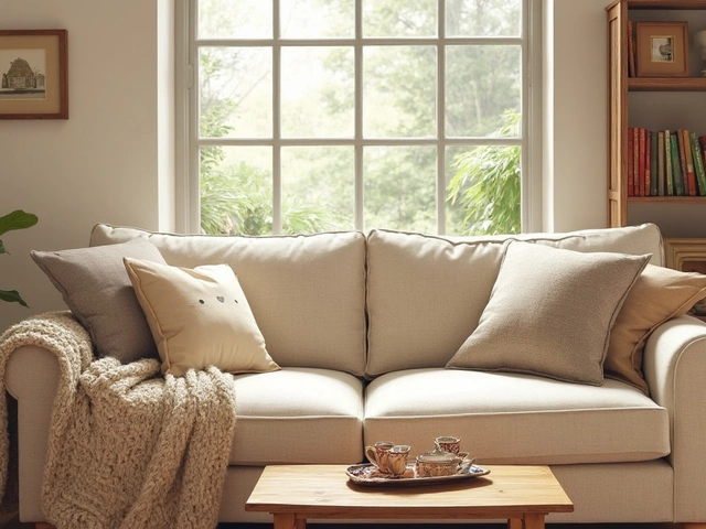
Neutral cushions—think beige, gray, ivory—rarely go wrong. You can layer them for a calm, spa-like feel, or throw in one or two bolder shades for interest. According to a 2023 UK interior trends report, 72% of home design experts recommended earthy neutrals as a base, then suggested adding at least two colored or patterned cushions to avoid blandness.
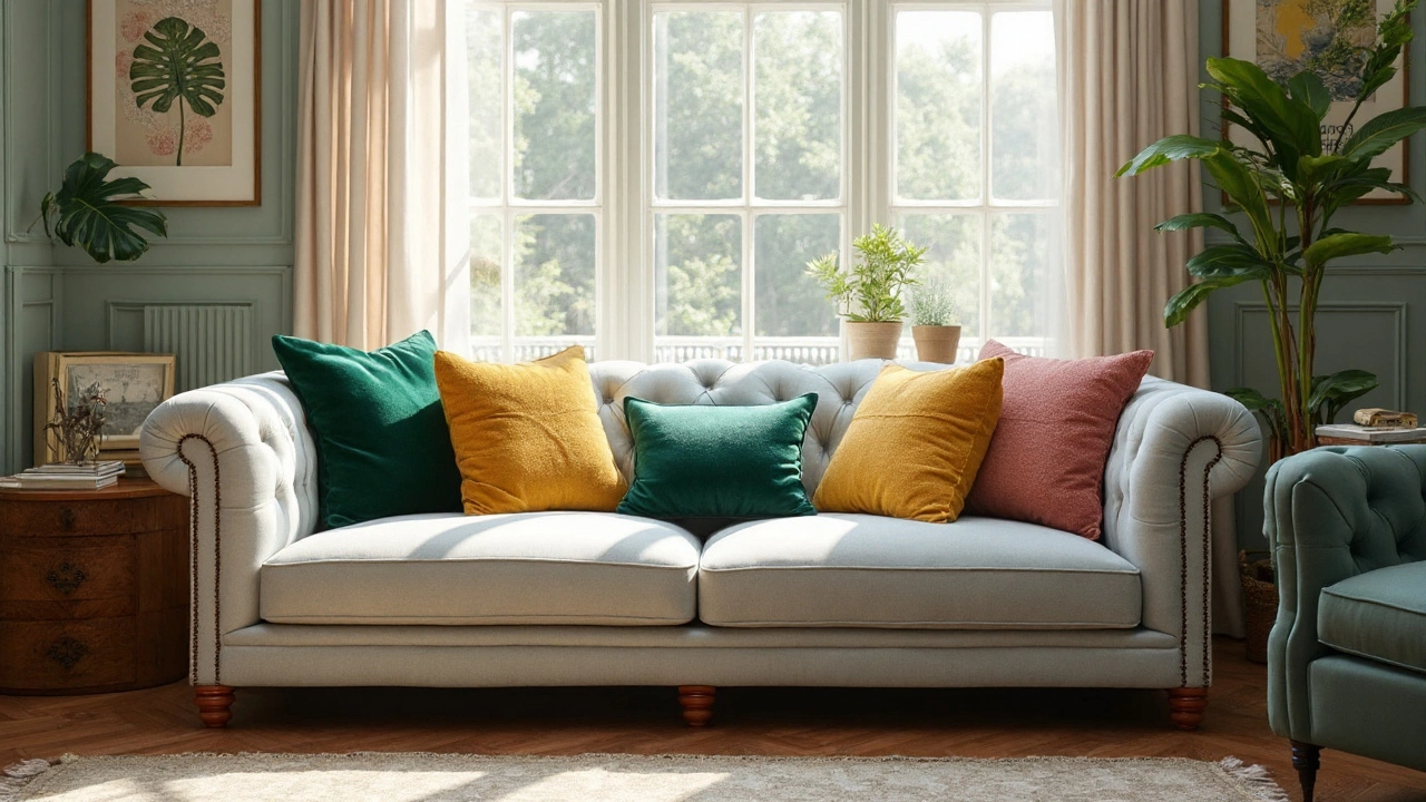
If you like a more energetic look, use the ‘rule of three’: choose three colors from your space—like a teal rug, rust-orange vase, and cream curtains—then bring them into your cushions. Don’t feel boxed in, though; texture and patterns count, so a waffle-knit cream cushion and a fringed one in burnt orange can count as two flavors of the same color.
Patterns pack a punch too, but there’s no need to be scared. Pair a patterned cushion (stripes, geometrics, botanicals) with a solid one in a color from that pattern for cohesion. Mix large-scale prints with small-scale ones so they don’t fight for attention.
Here’s a table with some well-known color combos that rarely miss the mark:
| Main Color | Matching Colors | Style Vibe |
|---|---|---|
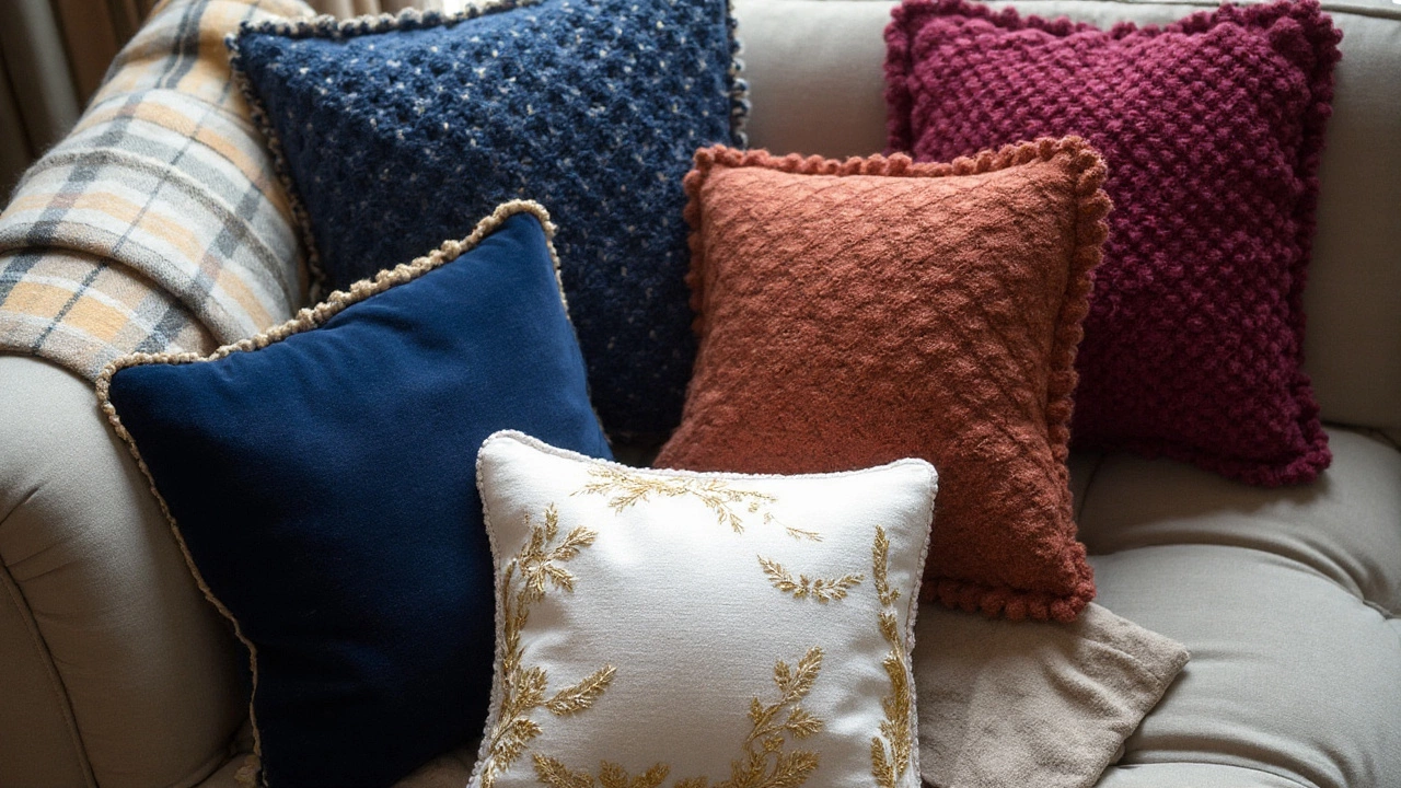
| Deep Blue | Mustard Yellow, Grey, White | Modern, Dramatic |
| Terracotta | Blush Pink, Sage Green, Beige | Earthy, Relaxed |
| Olive Green | Rust, Cream, Gold | Warm, Eclectic |
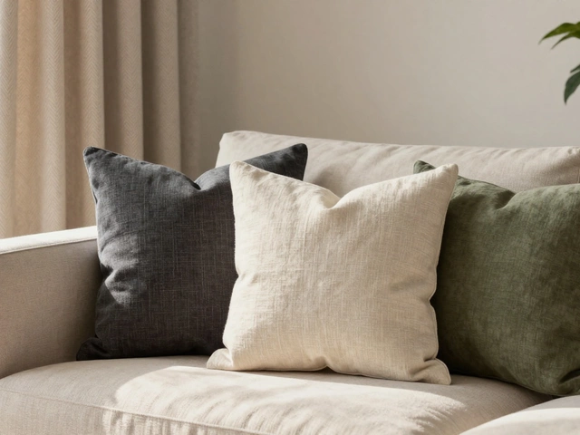
| Charcoal Gray | Soft Blue, Yellow, Ivory | Fresh, Urban |
| Beige | Burnt Orange, Teal, Navy | Timeless, Calm |
Once you get the hang of grouping cushions by color and tone, your wildest pattern/texture combos suddenly make sense. And you’ll never have to second-guess that bold pop of canary yellow ever again.
Mix, Match, and Master: Tricks for Balancing Cushion Colors
Let’s get practical. You don’t need an interior design degree—just a plan and a little playfulness. Think of your sofa as the anchor. If your sofa is a bold color, lean toward neutral or muted cushions so things don’t get too overwhelming. But if your sofa’s a plain or neutral tone, you’ve got room to go wild with brighter shades and prints.
One of my favorite tricks is to start with a hero cushion—the one piece that really stands out, often with a pattern or a unique texture. Pull one or two colors from that cushion, and pick other cushions that highlight those shades. Throw in a plain, knitted, or textured pillow in a matching or accent color. This trick almost always works, even if you know nothing about color harmony. A velvet emerald green floral cushion, for example, pairs perfectly with a plain mustard yellow and a ribbed cream cushion.
Textiles are your secret weapon when you’re worried about clashing colors. Mix up fabrics: velvet, linen, chunky knits, or faux fur. Even if two cushions are the exact same color, different textures will make them stand apart and keep things interesting. A 2024 survey by Scandinavian Living found that households who mixed up their textile choices (not just colors) rated their living spaces as "warmer and more inviting."
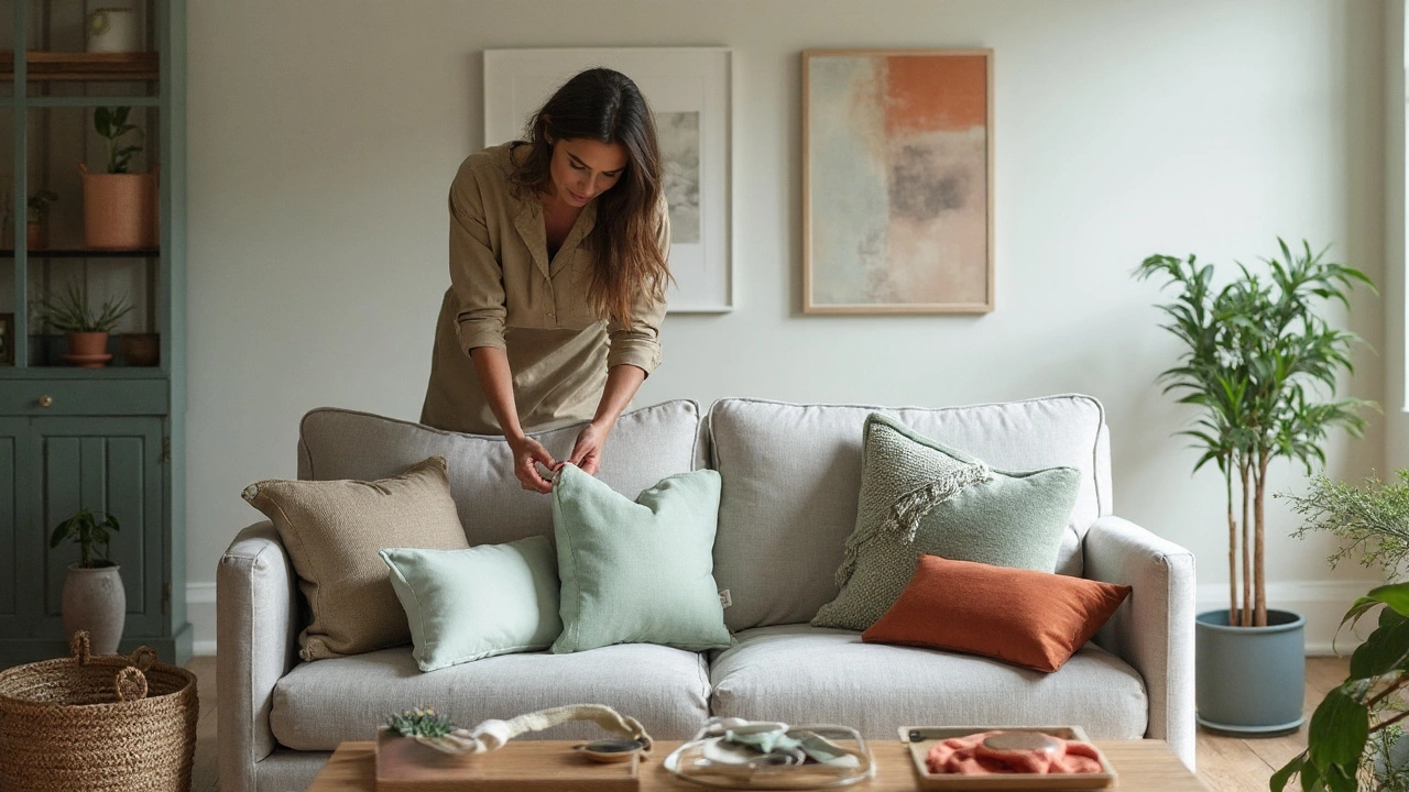
Don’t forget shape and size, either. Mixing 50x50cm squares with a 30x50cm lumbar pillow or a round cushion breaks up any monotony and feels visually soft. Use odd numbers—three or five cushions per sofa section look more natural than even numbers, which can feel stiff.
Ever heard of hue saturation? Even if blue and red make you think “no way,” a dusty, faded red next to a deep navy can look gorgeous—because the saturation (the color’s strength) is dialed down. Pastels play nicely together, just like jewel tones or rich, earthy hues do.
Here’s how you can instantly upgrade your cushion game in a few steps:
- Pick One Dominant Color. It can be your rug, a painting, or even a cool vase. Match one cushion to it.
- Add Variety with Accent Colors. Pull two or three colors from art or decor nearby.
- Include a Textured or Patterned Cushion. It’ll make the grouping look more intentional.
- Layer with Neutrals. Use beige, cream, or light gray to tone down any busy patterns.
- Experiment with Placement. Don’t just stack cushions at both ends—layer them diagonally or with one off-center.
Making your cushions look like they were styled by a pro doesn’t actually mean buying a lot of new stuff. Use what you have, move pieces between rooms, and only shop to fill color gaps—not just to pile on more. And if you’re lost, take a picture with your phone, switch it to black-and-white, and see if anything stands out too much. If it does, tweak.
One underestimated move: repeat colors throughout the room. If you use blue on a cushion, throw a blue vase or a blue candle holder somewhere visible. The eye loves a bit of repetition, and the room feels put-together in a way people can’t always put their finger on—trust me, it works every time.
Real-Life Combinations and Tips for Different Styles
Let’s break it down by popular styles and show what color cushions actually work—living room inspo isn’t just for glossy magazines. If you lean towards minimalist, think of tonal layering. Opt for pale gray, white, and wheat-toned cushions on a light couch. Use textures like boucle or light cotton to keep things fresh, and add a gentle accent, like a soft blush pillow, for personality—but stop before things get cluttered. Scandi-inspired homes love this vibe. The trick is to use similar undertones, like all cool or all warm, so even if the color shifts, the mood stays chill.
Boho lovers can mix jewel tones and earthy shades without fear. Picture terracotta, olive, and deep teal on a camel-colored sofa, sprinkled with a kilim-print cushion for drama. Add a long, mustard fringed pillow and a vintage velvet one in rusty red, and it’s *chef’s kiss* cozy. Balance is key—don’t let more than two cushions fight for attention, and break up bold colors with a simple, woven cream pillow in the center.
If your space is classic or traditional, your palette probably revolves around navy, burgundy, forest green, or taupe. Use stripes or subtle florals, solid navy or forest green, finished with a small deep golden cushion. Patterns here tend to be understated—no loud abstracts or neon. Layering cushions by depth of color makes classics feel chic, not stuffy, and feels right at home next to old-school wood coffee tables and brass lamps.
Modern glam has a soft spot for high contrast. Think black cushions with white piping, dusty pink mixed with metallic gold or silver, or deep emerald paired with crisp white. Use velvet for instant glam—just don’t go for more than one full-on shimmer or sequin cushion, or it shifts from glam to gaudy real fast. Keep shapes tailored and clean, with maybe one larger rectangular bolster to add some geometry.
Families or shared spaces call for practicality and trend-proof combos—navy, moss, and gray with a stripe or two, chunky knits, or washable covers. Mix in bold patterns for a kid-friendly vibe, but ground them with plain, dark-toned pillows that hide chocolate smudges and pet hair. Washable fabrics like cotton and blends are your friend here.
No matter your style, remember that lighting changes everything. Natural sunlight makes colors look lighter, while warm bulbs make reds rosier and blues deeper. Take a cushion to the window before matching—often what looks "right" in-store looks shockingly different in your real room. This is why plenty of designers borrow fabric swatches or even cushions before making a decision.
Finally, you don’t have to reinvent your whole color scheme each season. Swap out only your accent cushions when the weather changes—pastel or bright covers for spring, deep berry or caramel for fall, chunky white knits for winter. Small swaps keep things interesting without breaking the bank.
Mixing colors with cushions is part art, part science, and a whole lot more fun once you know the ground rules. Play around, trust your gut, and if your space makes you smile every time you walk in, you nailed it. So grab a couple of those wild cushions you’ve been eyeing, and make your sofa the most inviting spot in the house.