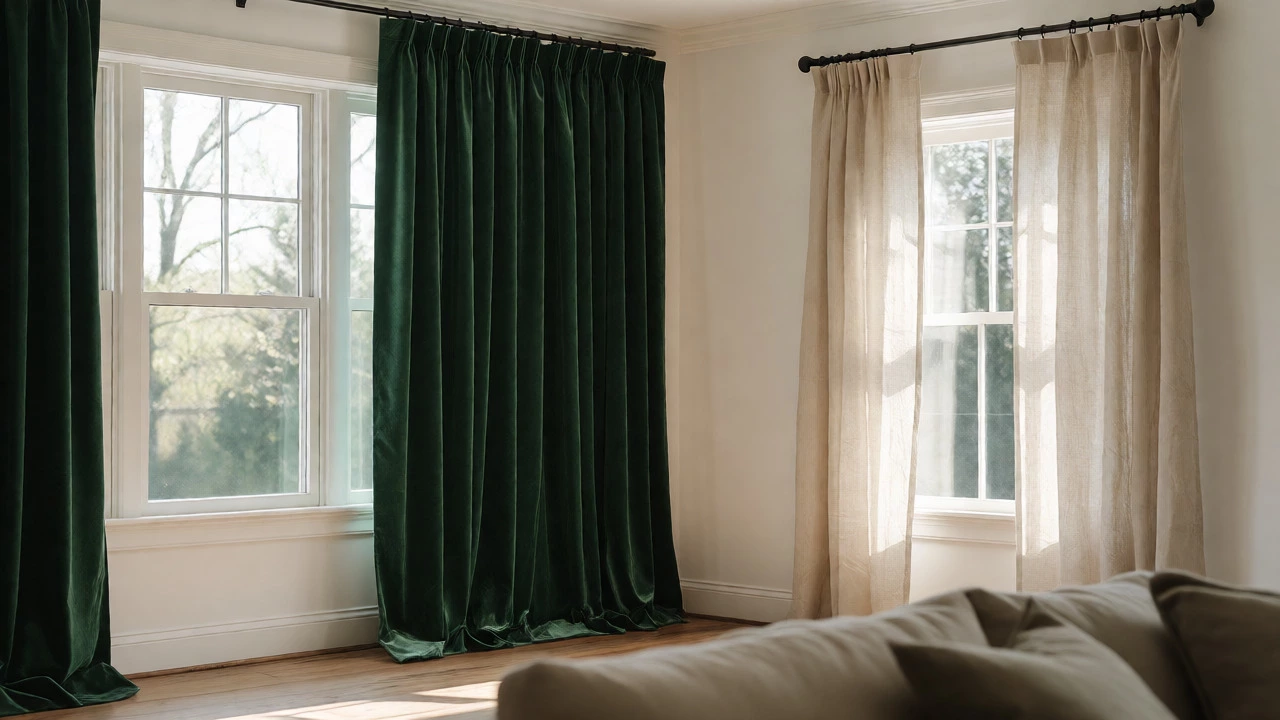
You’re standing in your living room, staring at two different windows. One faces the street, the other looks out to the garden. You have a beautiful set of heavy velvet drapes for the big bay window, but you also need something lighter for the smaller side window. The question hits you: should all curtains in a room be the same? If they don’t match perfectly, does it look messy? Or is matching actually boring?
The short answer is no, they don’t have to be identical. But there’s a right way and a wrong way to break that rule. Matching creates unity; breaking it creates interest. It’s not about following rigid laws-it’s about understanding how visual weight and color harmony work together. Let’s figure out exactly when to play it safe and when to get creative.
The Case for Uniformity: Why Matching Works
There’s a reason designers default to matching curtains most of the time. When every window in a room wears the same fabric, length, and hardware, the space feels calm and cohesive. Your eye moves smoothly across the room without getting stuck on differences. This is especially true in small rooms or spaces with multiple small windows. If you put three different patterns on three tiny windows, the room starts to look like a patchwork quilt rather than a designed space.
Uniformity also simplifies maintenance. If you buy one large bolt of fabric, you save money on bulk pricing. Cleaning becomes easier because you can wash everything together. Plus, if you ever decide to change your style, you only have to swap out one type of treatment. For rental properties or homes you plan to sell quickly, matching curtains are a safe bet. They appeal to the widest range of buyers because they feel "finished" and neutral.
Think of matching curtains as the background music of a room. They support the furniture and walls without demanding attention. If your room already has bold wallpaper, a colorful rug, or an eclectic mix of art, uniform curtains keep things from becoming chaotic. They provide a visual anchor that ties disparate elements together.
When Breaking the Rule Makes Sense
So, when should you ignore the matching rule? Usually, when function dictates form. A bedroom needs blackout curtains for sleep, while the adjacent sitting area might want sheer linen for morning light. In this case, forcing them to match would hurt the room’s usability. Here, you aren't trying to make a stylistic statement; you're solving a practical problem. The key is to ensure the fabrics still share a common thread-perhaps the same color palette or similar texture-even if the opacity differs.
Another scenario involves architectural variety. Maybe you have a standard rectangular window next to a French door or a circular porthole window. Using the exact same pleating and hanging method on both often looks awkward because the proportions are so different. A French door might look better with simple panels that slide aside, while a standard window shines with deep pinch pleats. Varying the style based on the window shape shows thoughtfulness, not carelessness.
Layering is another great excuse for variation. You might use solid-colored sheers on all windows for privacy during the day, but add patterned drapery panels only on the main focal window. This creates a hierarchy. The eye goes to the dramatic window first, then relaxes on the simpler ones. It adds depth without overwhelming the space. This technique works particularly well in formal dining rooms or master suites where you want one specific area to stand out.
How to Mix and Match Without Looking Messy
If you decide to go mismatched, you need a strategy. Randomness looks like clutter; intentional mixing looks like design. The golden rule is to limit your variables. Pick one element to vary and keep the others consistent. For example, if you change the pattern, keep the color family the same. Or, if you change the length, keep the fabric identical.
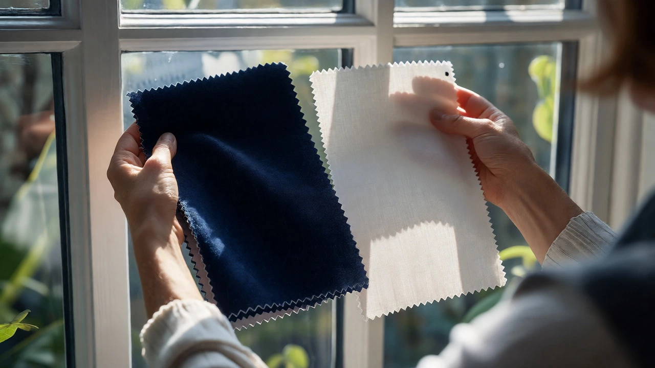
Consider the concept of "visual weight." Dark, heavy fabrics look heavier than light, airy ones. If you pair a heavy navy velvet with a light beige linen, the room might feel unbalanced unless the larger window gets the heavier treatment. Always assign the heavier, darker, or more complex curtain to the largest or most prominent window. Smaller windows should generally get lighter, simpler treatments to avoid competing for attention.
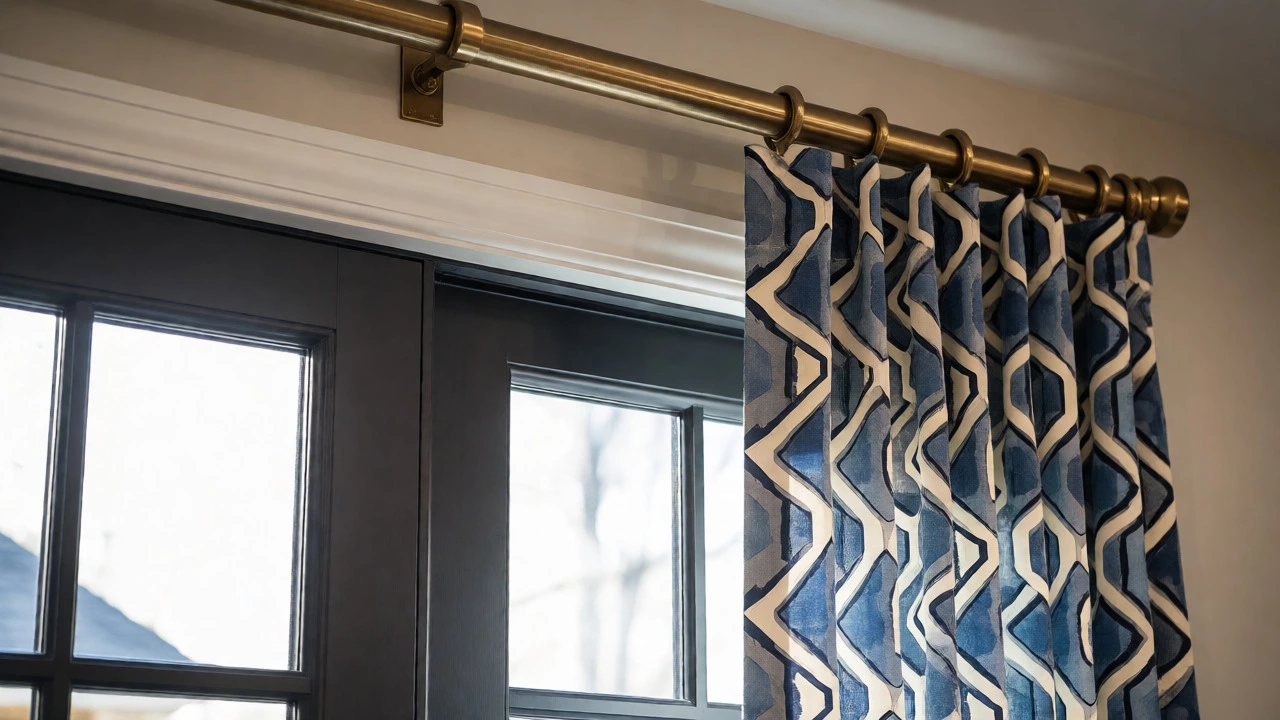
Hardware can also unify mixed curtains. If you use different fabrics but hang them all on the same matte black rod system, the consistency of the hardware ties the look together. The brain registers the repeated metal finish as a deliberate choice, forgiving the differences in fabric. Conversely, if you mix fabrics and mix hardware styles (brass here, chrome there), it can start to look accidental.
Common Mistakes to Avoid
The biggest mistake people make is mixing too many patterns at once. Stick to the 60-30-10 rule adapted for textiles. Let one dominant pattern or solid take up 60% of the window area, a secondary texture take up 30%, and an accent take up 10%. Never try to balance three equally loud patterns on three equal-sized windows. It creates visual noise that makes the room feel smaller and more stressful.
Another pitfall is ignoring scale. A large floral print on a small window can look cramped, while a tiny geometric print on a huge wall of glass can look busy and cheap. Scale matters more than matching. Ensure the size of the pattern relates appropriately to the size of the window. If you’re unsure, solids are always safer for large windows, and subtle textures work better for small ones.
Finally, don’t forget about light control. Mismatched curtains often lead to mismatched lighting experiences. If one window blocks 90% of light and the other lets in 50%, the room will feel unevenly lit throughout the day. Test your choices by observing how the light changes at different times. Sometimes, what looks good in a store sample looks completely different when sunlight filters through it.
| Scenario | Recommended Approach | Why It Works |
|---|---|---|
| Small Room / Multiple Small Windows | Matching | Creates illusion of space; reduces visual clutter. |
| Focal Point Window (e.g., Bay Window) | Mixed (Statement + Solids) | Highlights architecture; adds depth without chaos. |
| Bedroom with Different Functions | Mixed (Blackout + Sheer) | Prioritizes function (sleep vs. light) over strict aesthetics. |
| Rental / Resale Home | Matching | Neutral appeal; easy to maintain; perceived as higher value. |
| Ecclectic / Boho Style | Mixed (Textures/Patterns) | Supports the theme's natural lack of symmetry. |
Practical Tips for Execution
Start with the floor. Decide on the hemline before you choose fabrics. Should they puddle slightly on the floor for drama, or graze the floor for a clean modern look? Keep the hemline consistent even if the fabrics differ. If one curtain pools and the other stops six inches above the sill, the inconsistency draws negative attention. Consistency in placement is just as important as consistency in material.
Use swatches. Never buy full-length curtains based on a small square. Tape your chosen fabrics next to each other on the actual window frame. Look at them in daylight and artificial light. Do they clash? Do they harmonize? Does one color dominate the other unexpectedly? Seeing them in context prevents expensive regrets.
Consider tiebacks. If you’re worried about mismatched curtains looking disjointed, use matching tiebacks or holdbacks. These small accessories act as punctuation marks, signaling that the arrangement was intentional. A unified brass hook on different colored drapes instantly connects them visually.
Do curtains need to match the walls?
No, they don't need to match the walls exactly. In fact, matching them too closely can make a room feel flat. Aim for contrast or tonal variation. If your walls are white, consider cream, gray, or a bold color for curtains to define the window space. If your walls are dark, lighter curtains can brighten the room. The goal is harmony, not duplication.
Can I use different lengths for curtains in the same room?
It is possible, but risky. Different lengths usually imply different functions or architectural features. For example, kitchen windows might be shorter for practicality, while living room windows are floor-length. However, within a single open-plan space, varying lengths can look accidental. If you must vary lengths, ensure the difference is significant enough to look deliberate, or keep the top mounting height consistent to create a horizontal line.
Is it okay to mix patterns and solids?
Yes, this is a classic design technique. Pairing a bold patterned curtain with a solid curtain helps balance the visual weight. The solid acts as a resting place for the eye. Just ensure the colors in the pattern are echoed in the solid curtain to maintain cohesion. For instance, if the pattern has blue flowers, use a solid blue curtain nearby.
What if my windows are different shapes?
Different shapes almost always require different treatments. A rectangular window might suit standard pinch pleats, while a French door needs sliding panels. An arched window might require custom tailoring or valances. Don't force a square peg into a round hole. Adapt the style to the shape, but try to keep the fabric or color palette consistent to tie the diverse shapes together.
Does matching curtains increase home value?
Generally, yes. Neutral, high-quality matching curtains suggest a well-maintained and professionally styled home. Buyers often prefer neutral backdrops that allow them to project their own style. Bold, mismatched choices can sometimes be seen as personal taste issues, potentially narrowing the buyer pool. For resale, stick to safe, cohesive designs.