Luxury Curtain Calculator
Window Measurements (Inches)
Your Designer Specifications
(Based on 2:1 fullness ratio)
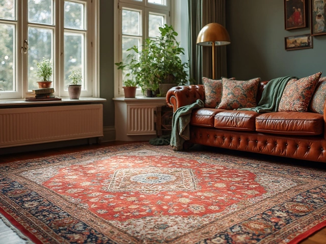
Ever walked into a hotel lobby or a boutique shop and felt that immediate sense of calm and sophistication? Chances are, you didn’t notice the expensive art or the custom furniture first. You noticed the windows. They were dressed in soft, floor-grazing folds that seemed to breathe with the room. Now, look at your own living room. Do your curtains hang stiffly above the sill, or do they pool slightly on the carpet? The difference between "rental apartment" and "designer home" often comes down to one thing: how you treat your windows.
You don’t need a renovation budget to achieve this look. In fact, most people overspend on brands while underspending on installation and fabric quality. Making your home look expensive with curtains is less about price tags and more about proportion, texture, and light control. It’s about creating a backdrop that makes everything else in the room pop. Let’s break down exactly how to get that high-end feel without breaking the bank.
The Power of Scale and Proportion
The number one mistake homeowners make is buying curtains that are too short or too narrow. Cheap-looking curtains usually stop right at the window frame or hover an inch above the floor. This cuts off the vertical lines of the room, making ceilings appear lower and windows smaller. To create an expensive aesthetic, you need to trick the eye.
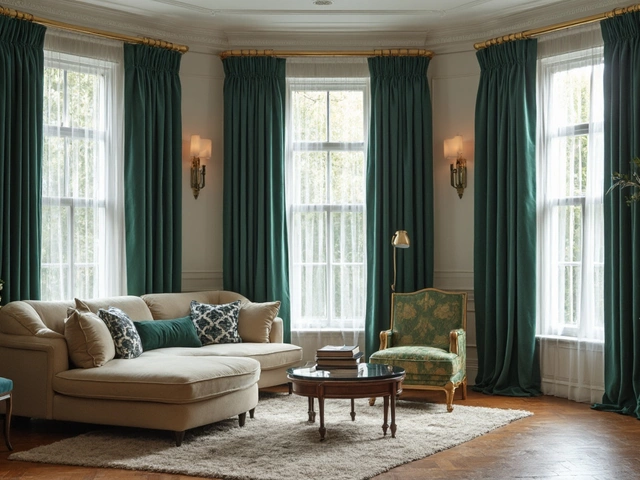
Start by mounting your curtain rod as high as possible. Ideally, place it just below the crown molding or about two to three inches from the ceiling. If you don’t have molding, aim for six to twelve inches above the top of the window frame. This draws the eye upward, elongating the walls and making the room feel grander. Next, ensure the width of the rod extends well beyond the window frame-ideally six to ten inches on each side. When you open the curtains, they should stack back against the wall, not block the glass. This maximizes natural light and makes the window appear wider than it actually is.
For the length, there are two acceptable looks in high-end design. First, the "just-kiss" method, where the hem touches the floor precisely. Second, the "slight puddle," where the fabric pools on the floor by about two inches. Avoid anything shorter. Hemming curtains yourself or paying a tailor to lengthen them is a small investment that yields massive visual returns. Long, uninterrupted lines signal luxury; choppy, short lines signal DIY shortcuts.
Fabric Matters More Than Pattern
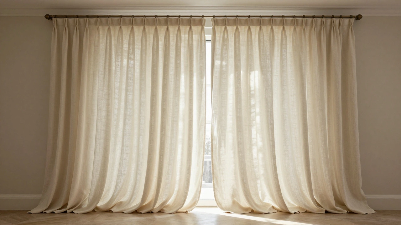
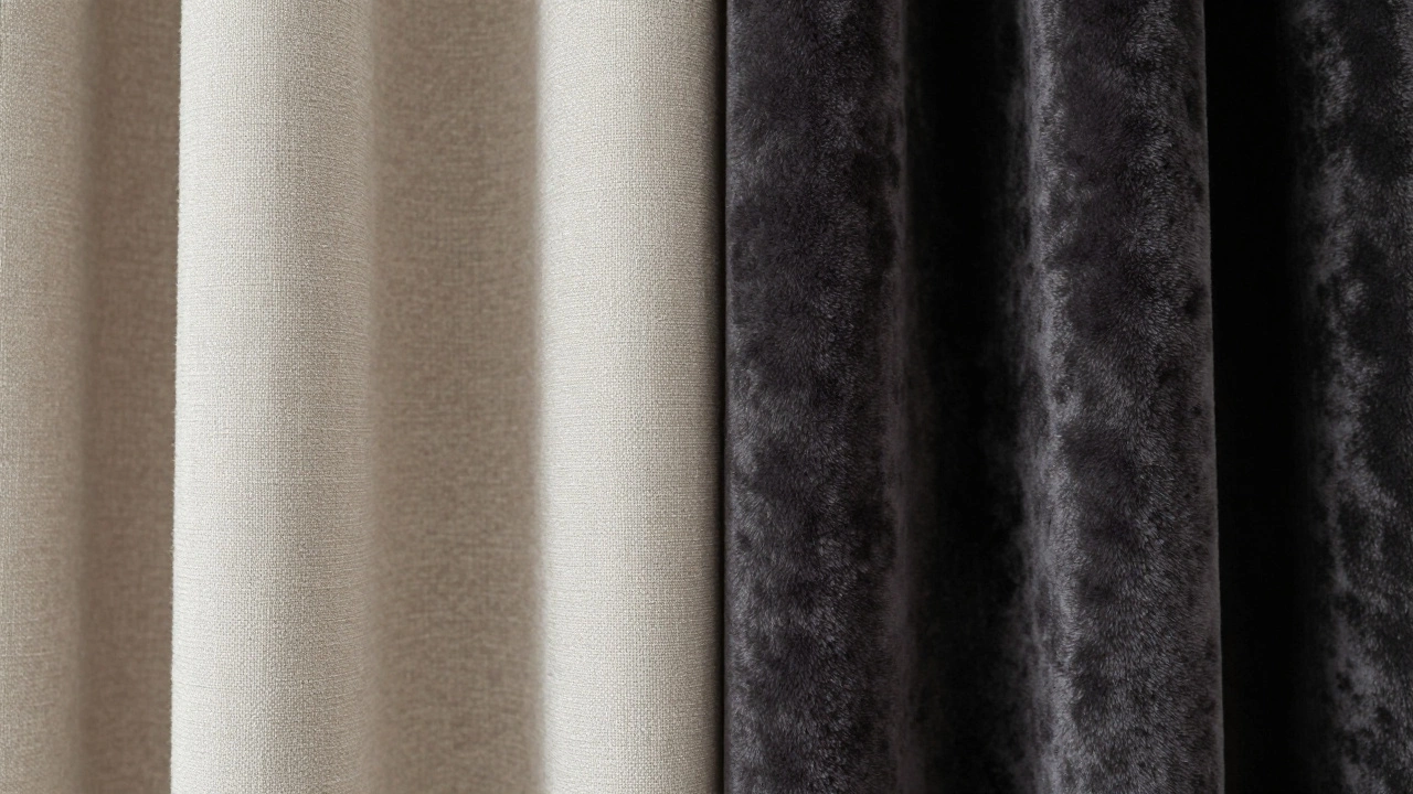
When shopping for window treatments, resist the urge to buy the cheapest polyester blend available. Fabric weight and texture dictate how light interacts with the material. Thin, shiny fabrics reflect light harshly and reveal every wrinkle, which can look cheap. Instead, look for natural fibers or high-quality blends like linen, cotton-linen mixes, velvet, or heavy silk.
Linen is particularly effective because of its inherent texture. It has a relaxed, organic drape that feels both casual and sophisticated. Even if you buy a synthetic linen-look fabric, choose one with a matte finish and a heavier weave. Velvet adds drama and depth, especially in bedrooms or formal living areas, as it absorbs light rather than reflecting it. For sheer curtains, opt for a crisp cotton voile or a fine mesh rather than flimsy plastic-like netting.
Consider the opacity of the fabric relative to the room’s function. In a bedroom, layering is key. Use a blackout lining behind a decorative outer panel. In a living room, a single layer of medium-weight linen allows light to filter through softly during the day while providing privacy at night. The goal is to avoid the "plastic wrap" effect. Light should pass through the fabric gently, creating shadows and highlights that add dimension to the wall.
Color Psychology and Neutrality
Expensive homes rarely rely on loud, clashing patterns for their window treatments. While bold prints have their place, they can date a room quickly and distract from other design elements. The hallmark of timeless, high-end decor is a neutral palette. Think warm whites, creams, taupes, charcoals, and soft grays.
Why neutrals? They act as a blank canvas. A cream-colored linen curtain will complement a blue sofa, a wooden bookshelf, and a green plant equally well. It unifies the room. If you want color, introduce it through accessories like cushions or artwork, which are easier to change than curtains. However, if you must use pattern, keep it subtle. A faint stripe, a tonal jacquard, or a simple geometric weave adds interest without overwhelming the senses.
Also, consider the undertones of your walls. If your walls are cool gray, choose a curtain with a similar cool undertone, like a slate blue or a crisp white. If your walls are warm beige, go for ivory or oatmeal. Matching the undertone creates a seamless flow, while contrasting undertones can make the curtains look like an afterthought. Test fabric swatches against your wall paint in different lighting conditions before committing.
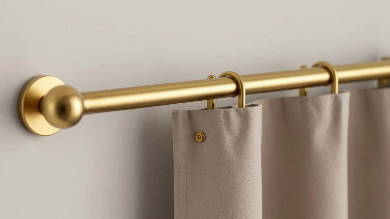
Hardware: The Unsung Hero
You can buy the most luxurious fabric in the world, but if you hang it on a thin, white plastic rod with visible screws, the illusion breaks. Hardware is the jewelry of your window. Invest in a sturdy rod that matches the finish of your other metal accents in the room-whether that’s brass, black nickel, brushed gold, or chrome.
Look for rods with a diameter of at least one inch. Thicker rods support heavier fabrics better and look more substantial. Ensure the finials (the decorative ends) are sleek and modern. Avoid ornate, bulky finials unless you’re going for a very specific traditional style. Simple spheres or tapered cylinders work best for contemporary spaces.
Don’t forget the brackets. They should be spaced closely enough to prevent sagging, especially if you’re using heavy velvet or lined drapes. Three or four brackets per rod are standard for average-sized windows. If you’re doing a wide expanse, add extra supports. The hardware should disappear into the design, holding the fabric up securely without drawing attention to itself.
Layering for Depth and Function
Single-layer curtains are fine for minimalists, but layering adds instant depth and complexity. Combining a sheer under-curtain with a heavier outer drape allows you to control light and privacy independently. During the day, draw the sheers to let in diffused light while maintaining privacy. At night, close the opaque layers for darkness and warmth.
To execute this cleanly, use a double rod system. One rod sits closer to the wall for the sheers, and the other sits further out for the main drapes. This ensures the heavier fabric doesn’t bunch up awkwardly when opened. Keep the colors coordinated. A white sheer paired with a taupe drape works beautifully. Avoid mixing disparate textures or colors that clash. The sheer should always be lighter than the outer layer to maintain visual hierarchy.
Maintenance and Presentation
Even the most expensive-looking curtains will fail if they are wrinkled, dusty, or stained. High-end interiors are curated, not just decorated. Iron or steam your curtains regularly. Wrinkles suggest neglect. If your curtains are dry-clean only, budget for professional cleaning once or twice a year. For machine-washable linens, wash them on a gentle cycle and hang them immediately to air dry to minimize wrinkles.
Dust accumulates on fabric over time, dulling its appearance. Vacuum your curtains with the upholstery attachment every few months. Pay attention to the hems, which trap dust from the floor. Finally, check the pleats. Pinch pleats or grommet tops should be even and uniform. If a pleat falls out of place, smooth it back into position. These small details signal care and intentionality, which are the true markers of an expensive-looking home.
| Element | Low-End Look | High-End Look |
|---|---|---|
| Height | Above window frame | Near ceiling or crown molding |
| Width | Flush with window trim | Extends 6-10 inches past frame |
| Length | Hovers above floor | Kisses floor or slight puddle |
| Fabric | Thin, shiny polyester | Heavy linen, velvet, or cotton blend |
| Hardware | Thin plastic or wire | Thick metal matching room accents |
Common Pitfalls to Avoid
One major error is buying ready-made curtains that are too short. Most mass-produced options come in standard lengths like 63, 84, or 96 inches. Unless your ceilings are perfectly standard, these rarely fit correctly. Always measure from the top of your chosen rod height to the floor (plus any desired puddle). If you buy ready-mades, expect to pay for hemming. It’s worth it.
Another pitfall is ignoring the fullness ratio. Curtains need to be wider than the window to create beautiful folds when closed. A good rule of thumb is a 2:1 ratio. If your window is 50 inches wide, your combined curtain panels should be 100 inches wide. If they are only as wide as the window, they will look flat and stretched when drawn shut. Check the total width of the panels, not just the width of one side.
Lastly, don’t mix styles indiscriminately. Grommet tops (metal rings sewn into the fabric) offer a clean, modern look but lack the tailored elegance of pinch pleats or pencil pleats. Choose one style and stick with it throughout the house for consistency. Mixing grommets in the living room with tie-backs in the bedroom can make the decor feel disjointed.
What is the best fabric for expensive-looking curtains?
Linen and linen-blend fabrics are top choices for a high-end look because of their natural texture and soft drape. Velvet is also excellent for adding luxury and sound absorption. Avoid thin, shiny synthetics that wrinkle easily.
Should curtains touch the floor or hang above it?
For a polished look, curtains should either "kiss" the floor (touching it lightly) or have a "slight puddle" (pooling 1-2 inches on the floor). Hanging them above the floor makes the room look shorter and less finished.
How high should I install my curtain rod?
Install the rod 4-6 inches above the window frame, or ideally, near the ceiling or crown molding. This creates vertical lines that make ceilings appear higher and rooms more spacious.
Do I need to line my curtains?
Lining adds weight, improves insulation, and protects fabric from sun damage. For bedrooms, blackout lining is essential. For living rooms, a standard interlining can help the fabric drape more luxuriously and last longer.
Can I make cheap curtains look expensive?
Yes. Focus on proper installation (high and wide), correct length (floor-length), and ironing. Adding a heavy liner can also improve the drape of cheaper fabrics, making them hang more smoothly.