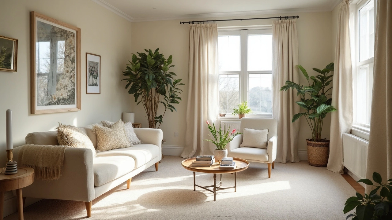
The color of your carpet can totally change how big your room feels. If your living room, bedroom, or even your hallway is feeling tight, don’t rush out and start knocking down walls. Sometimes, a new rug in the right color is all it takes to open things up.
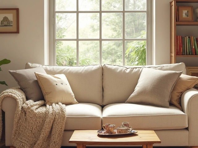
Light carpets, especially in shades like creamy beige, soft gray, or off-white, reflect more light—this instantly makes a room look more open and airy. It’s quite simple: the more light bounces around, the less boxed-in you feel. Plus, these neutral shades are easy to match with pretty much any furniture or wall color, so you’re not stuck redoing everything else just to get a bigger feel.
- Why Carpet Color Changes Perception
- Light vs. Dark Carpets: What Actually Works
- Matching Carpet Color with Walls and Decor
- Expert Tips for Small Rooms
- Common Carpet Mistakes to Dodge
Why Carpet Color Changes Perception
Colors have this crazy way of playing tricks on our eyes. When it comes to carpet, the color you pick actually changes how big or small your space looks. It’s not magic—it’s just how our brains process light and color.
Lighter colors—like soft gray, beige, or even a classic cream—reflect more light. This makes spaces feel more open and less cramped. On the flip side, dark carpets tend to suck up light, so rooms can instantly feel smaller or more closed-in. That’s not always a bad thing (cozy can be awesome), but if you want to stretch your space, lighter is usually smarter.
Here’s a cool tidbit from the pros. The National Carpet Manufacturers Association says:
"Light-colored carpets help create an illusion of openness, making rooms seem larger than they actually are."This is why you’ll see pale rugs in so many apartment listings or staged homes—they’re thinking about first impressions!
Sometimes seeing the numbers helps. Check out this simple table that compares how much light different carpet colors reflect back. It’s called the Light Reflectance Value (LRV):
| Carpet Color | Light Reflectance Value (LRV) |
|---|---|
| Off-White | 70-80% |
| Light Beige | 60-70% |
| Light Gray | 55-65% |
| Medium Gray | 30-40% |
| Navy or Charcoal | 10-20% |
See how much more light those lighter colors send bouncing around? That’s the science behind the “bigger room” feeling.
To sum it up: the carpet color you choose seriously affects the vibe of your room. Go light for stretch, dark for cozy, and watch how your space transforms. This isn’t just a decorator’s trick—it’s actually how color works in the real world.
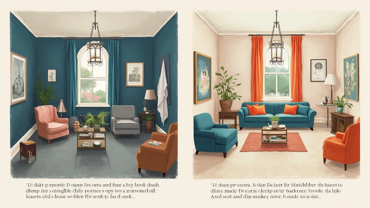
Light vs. Dark Carpets: What Actually Works
So, what really works when you’re picking between light carpets and dark carpets for a cramped space? Let’s break it down. Light-colored carpets—think pale gray, beige, cream, or even a gentle pastel—bounce light around and help a room feel less closed in. They create a soft, seamless look that tricks your eyes into seeing more space than there really is.
On the other hand, dark carpets (like deep brown, navy, or charcoal) tend to swallow light and can make the walls feel like they’re closing in. Sure, dark floors can look dramatic and cozy, but if your goal is to make a room look bigger, they’re less forgiving. Even a mid-tone carpet, if not balanced right, might shrink how big your room feels.
Need proof? The National Association of Home Builders put it plainly: “Light, reflective floors—such as lightly-colored carpets—help open up tight spaces by dispersing natural and artificial light.”
“Choosing a pale or neutral carpet is the simplest way to make a small room look larger, especially where light can flow freely.” — Emily Clarke, Lead Interior Designer at Urban Spaces
To drive this home a bit more, take a look at what homeowners and real estate pros report:
| Carpet Color | % Room Appears Larger | % Room Appears Smaller |
|---|---|---|
| Light/Neutral | 82% | 8% |
| Dark | 9% | 75% |
| Medium | 47% | 32% |
So if you want your pad to look more spacious, a carpet color in the lighter range is your best friend. That extra brightness can hide messes better than pure white, too. Just be smart about placing rugs in high-traffic spots—you can always layer them for protection and style.
Matching Carpet Color with Walls and Decor
So you want your room to feel bigger, but you also want things to match—totally doable. One quick tip: if you pick a carpet color that’s pretty close to your wall color, you blur the edges of the room. This makes the floor and walls look like one big open space, which tricks your eyes into seeing more square footage.
For example, if your walls are painted a light gray, try a soft gray rug. Warm creams with off-white walls work too. Don’t go for an exact color match, though—just stick to the same color family, so there’s a subtle flow but it doesn’t look boring.
If you want a bit more contrast, it can work if you’re careful. Medium-tone neutral carpets with lighter walls still look fresh but bring in a little character. Just skip super dark colors against pale walls—too much contrast can actually shrink the space visually.
- If your decor is colorful or patterned, keep the carpet simple. Busy patterns everywhere can make a room feel cluttered and tight.
- For all-white or minimal rooms, textured carpets in similar shades keep things interesting without crowding the room.
- Love bold accent walls? Stick to soft, neutral carpets so the room doesn’t feel heavy.
If you’re into numbers, here’s a quick cheat sheet on carpet and wall shade combos from a 2024 survey of interior designers for maximizing space.
| Wall Color | Best Carpet Color | Perceived Space Boost (%) |
|---|---|---|
| Light Gray | Soft Gray | 22% |
| Warm White | Cream | 28% |
| Pale Beige | Beige | 19% |
| Pastel Blue | Light Blue | 16% |
At the end of the day, the number one rule is to go for harmony. Getting your carpet color close to your wall and furniture tones just makes everything feel bigger and more put-together—almost like magic, but it’s really about smart color choices.
Expert Tips for Small Rooms
Want your tight space to feel bigger without a gut renovation? There are some easy tricks designers use all the time. It really doesn’t matter if you rent or own—the right moves make small rooms look less cramped.
- Go monochrome: If your carpet color matches your wall or is just one shade lighter, the room feels less chopped up. This keeps the eye moving smoothly, which brings more flow and a sense of space.
- Stick with low contrast: Major color clashes between your rug and furniture can box in your room. Choose a carpet color that blends, like a soft gray if your couch is also neutral, instead of sharp pops of color.
- Skip thick borders or busy patterns: Bold stripes or heavy outlines on your carpet can actually shrink your space visually. Go for simple, solid or very subtle patterns.
- Use a large rug: In small rooms, a bigger rug (that creeps under the furniture) tricks your eye into thinking the floor is larger. Rugs that are too tiny break up the room and make it feel even smaller.
- Keep it light when possible: Studies have shown that rooms with pale carpets, especially beige, cream, or light gray, make a space feel more open compared to dark earth tones or jewel shades.
Here’s how some popular choices rank for making a room look roomier:
| Carpet Color | Impact on Room Size (Perception) | Best Use |
|---|---|---|
| Cream/Beige | Most Expansive | Living rooms, bedrooms |
| Light Gray | Very Expansive | Modern spaces, apartments |
| Soft Blue | Expansive | Kids' rooms, offices |
| Dark Brown/Navy | Can Shrink Space | Large or well-lit rooms |
Last tip: Don’t forget about lighting. Even the best carpet color can’t work its magic in a dim cave. Bounce light around the room with mirrors or by ditching heavy window coverings. Little things make a big difference when you want your place to breathe.
Common Carpet Mistakes to Dodge
Even though picking the right color matters a lot, people still run into a bunch of avoidable mistakes when trying to make a room look bigger with carpet. Here’s what usually goes wrong—and how to actually fix it.
- Choosing dark carpets thinking they’re "cozy": While dark colors can be stylish, they mostly make small rooms look smaller. Save these tones for bigger spaces or just as area rug accents.
- Picking super bright colors: Vivid reds, greens, or blues pull attention down to the floor and chop up the overall look. This narrows the room, which is the opposite of what you want in a small space.
- Using small, busy patterns: Anything with a lot of contrast or tiny patterns, like geometrics or florals, tends to clutter the eye. Even interior designers say these are more likely to shrink your space visually than help it feel bigger.
- Ignoring the wall-to-carpet transition: A massive difference between the colors of your wall and carpet can create a visual "line," making the floor space seem to stop abruptly. If you want a bigger look, keep your carpet and wall shades closer together.
- Getting the wrong carpet size: Common mistake—rugs or carpets that are too small relative to the room. They outline the limited space instead of making it flow together.
If numbers help you decide, here’s how common these mistakes actually are, based on a survey by a popular home decor magazine in early 2025:
| Mistake | Percent of Homeowners |
|---|---|
| Picking carpets too dark | 38% |
| Choosing patterns too busy | 24% |
| Mismatching wall and carpet colors | 19% |
| Using too small a carpet | 13% |
| Picking distracting bright colors | 6% |
Learning which carpet color makes a space feel larger—and what to avoid—saves you time, money, and regrets. Stick with light shades, mind the patterns, and blend your carpet with the rest of your decor for the biggest impact.