60-30-20 Room Harmony Builder
Customize your room's color layers below. Watch how the material choice impacts the visual weight of your 20% accents.
Visual Hierarchy Check
Ever walk into a room and feel like something is slightly off? The furniture looks nice, the paint is fresh, yet the space feels unbalanced or cluttered. Often, the culprit isn't the layout; it's the color distribution. You don't need to be a professional designer to fix this visual noise. There is a mathematical formula that creates harmony almost every time, and it revolves around three simple numbers.
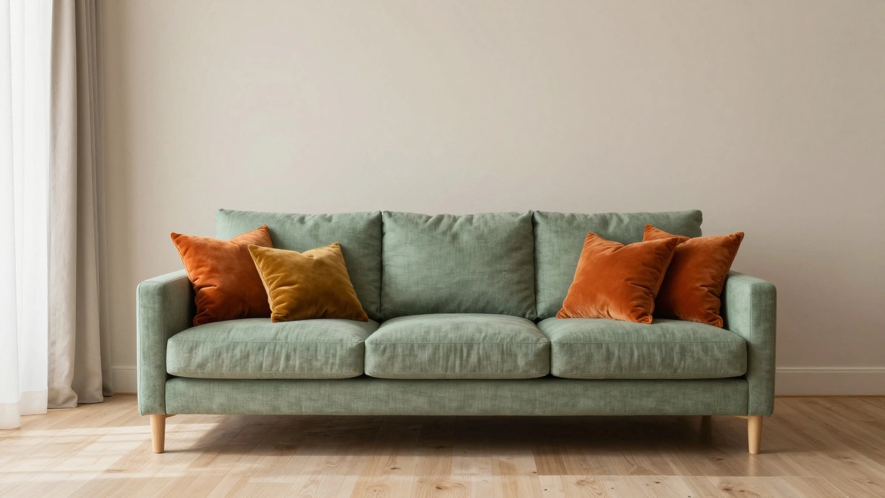
This concept is called the 60-30-20 Rule. 60-30-20 decorating rule In its simplest form, it dictates how you should split the colors in your room. Sixty percent of the space takes a dominant shade, thirty percent gets a secondary tone, and twenty percent is reserved for accents. While people often discuss walls and sofas first, this rule comes to life most vividly through soft furnishings, specifically cushions. Getting the ratio right on your couch transforms a living area from chaotic to curated without costing you a fortune.
Understanding the Core Percentages
Think of your room as a canvas. If you fill every inch with bold hues, your eyes have nowhere to rest. If everything is beige, the room feels flat and boring. The goal is visual hierarchy. The largest percentage, sixty percent, establishes the backdrop. In most homes, this means your wall paint and large carpet areas. This needs to be a neutral base-warm whites, soft greys, or gentle oatmeal tones. These colors recede into the background, making the room feel larger.
The thirty percent layer adds depth. This usually falls on your main seating furniture, like the sofa or armchairs, and potentially curtains or blinds. If your walls are white, your sofa might carry this middle tone. It grounds the room. It shouldn't clash with the sixty percent base but offers enough contrast to define the furniture's shape.
Finally, the twenty percent is where personality lives. This is your opportunity zone. This slice includes smaller items that can be swapped out easily. In many scenarios, these are decorative pillows, rugs, artwork, and lighting fixtures. Because these items are movable, changing them gives you a whole new vibe without repainting walls. When you focus on cushions here, you are leveraging the smallest percentage of the equation for maximum emotional impact.
Cushions as the Twenty Percent
Many homeowners get stuck trying to match cushions exactly to the sofa fabric. That approach ignores the energy dynamic required by the 60-30-20 rule. Your cushions should ideally live in that top twenty percent tier. If you own a standard charcoal grey sectional sofa, covering it entirely with matching grey cushions wastes the opportunity to introduce texture and contrast. Instead, view those pillows as the highlight reel.
Consider a Wellington home with typical north-facing windows. The natural light might be cooler or dimmer compared to equatorial regions. To counteract this, your twenty percent accent might need to be warmer than you initially planned. Imagine a linen sofa in a muted sage green (your thirty percent). Your walls are crisp white (sixty percent). If you add sage cushions, nothing pops. But swap in ochre or rust-colored velvet pillows, and suddenly the room breathes. Those cushions act as a bridge between the cool grey of the sky visible through the window and the warm tones of the timber flooring.
You don't need to calculate exact square footage, though it helps to understand the volume. When standing back to look at your seating arrangement, estimate the visual weight. Does the wall color dominate? Good. Does the sofa stand out against the wall? Good. Do the cushions catch your eye before anything else? Ideally, yes. They should be the first thing you notice besides the people sitting on the sofa.
Color Palettes and Texture Balance
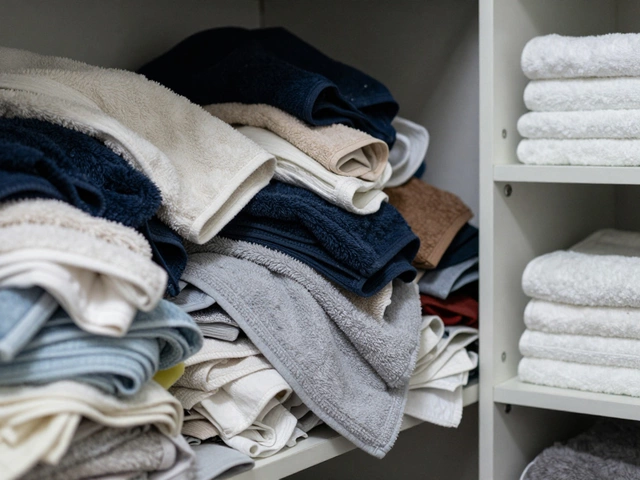
Applying the rule isn't just about choosing hex codes; it involves fabric choices too. Texture absorbs light differently than color. Velvet pulls shadows in a way linen does not. A shiny silk pillow will reflect more light, effectively acting as a lighter value than a matte cotton pillow of the same hue. When balancing the twenty percent, mix textures to add substance.
| Material Type | Light Reflection | Impact on 20% Tier |
|---|---|---|
| Linen / Cotton | Moderate / Matte | Grounds the accent with a casual feel |
| Velvet | High / Shiny | Increases perceived richness and luxury |
| Khadi / Woven | Low / Textured | Adds organic depth without high saturation |
| Silk / Satin | Very High / Glossy | Brightens dark spaces significantly |
If your base is very textured, like shaggy wool carpets or rough plaster walls, consider smoother cushion fabrics for the twenty percent to maintain balance. Conversely, sleek modern furniture pairs well with knitted or woven throws. The interplay between surface quality and pigment creates a layered look that feels expensive even on a modest budget.
Navigating Common Pitfalls
One frequent mistake is overcounting the cushion presence. If you put four identical navy blue pillows on a navy blue sofa, those pillows technically become part of the thirty percent layer rather than the twenty percent accent layer. This collapses the visual interest. To keep the integrity of the rule, vary the sizes and shapes. Use two large Euro squares and four standard lumbar pillows. Mix patterns if you must-a geometric print on one pillow and a solid block of color on another prevents the pattern from overwhelming the room.
Another error involves ignoring lighting conditions. Indoor lighting changes throughout the day. Morning sun washes out pastels, while evening artificial lights deepen reds and oranges. Test your cushion colors in the actual room before committing. Hold the fabric sample near your 60 percent wall color and your 30 percent sofa under the afternoon sun coming in from the west, and again under the glow of your floor lamp at night. If a colour disappears in the dark, it won't serve the twenty percent function of drawing attention.
Updating Spaces Without Renovation
The beauty of relying on the twenty percent rule for accessories is flexibility. Trends shift faster than paint dries. You don't need to repaint your entire house to chase a new style. Swap the cushions every season. Summer might call for breathable cotton in seafoam or terracotta. Winter could demand deeper jewel tones in heavy wools. Your 60 percent walls stay calm and timeless, providing a stable stage for these seasonal performances.
When buying new cushions, keep the count logical. An odd number usually reads better than an even number in asymmetric arrangements. Three or five pillows work better than four. Group them in clusters rather than lining them up perfectly. This relaxed arrangement mimics the natural chaos of life but keeps the underlying structure organized according to the 60-30-20 logic.
Practical Application Checklist
- Identify your main wall color as the sixty percent base.
- Select your primary furniture upholstery as the thirty percent support.
- Choose cushion fabrics that contrast in value (lightness/darkness) to the sofa.
- Ensure cushion colors appear elsewhere in the room to tie the space together.
- Rotate cushions based on seasonal lighting shifts or personal taste changes.
By anchoring your decisions to this rule, you eliminate guesswork. The room starts to feel intentional rather than accidental. Every element has a job to do. The cushions aren't just for comfort; they are strategic tools that anchor the design narrative.
Can I mix different shades of the same color in my 20 percent?
Yes, monochromatic schemes work well if textures vary. For example, use light blue velvet and navy blue linen cushions. As long as the values differ, it counts as part of your accent portion.
What if my sofa is already too colorful?
Treat the sofa as part of the 30 percent accent instead of the base. Make your cushions neutral (part of the 30%) and let your rugs or art take the full 20% bold accent role.
Does the rule apply to small rooms?
Absolutely. Smaller spaces benefit even more from the rule to prevent visual clutter. Keeping the bulk neutral makes the room feel larger.
How many cushions should I use for the 20 percent?
Is it okay to break the rule?
Design rules are guidelines. If a different ratio makes you happy, trust your instinct. However, sticking to the ratio usually ensures better visual flow.
Can I use the rule for outdoor patios?
Yes, applying it to outdoor cushions helps unify indoor and outdoor styles. Just ensure fabrics are weather-resistant.