Ever feel like your room is closing in on you? You’d be surprised how much difference curtain color can make. Most people worry about the sofa and rug when they’re trying to make a room feel bigger, but curtains often get overlooked. The truth is, the right curtain color can make your space look airy, open, and even a bit fancier without knocking down any walls.
The biggest trick? It’s all about how your eyes see color and light. Light colors bounce daylight around, making rooms look like they instantly gained a few extra feet. You don’t have to stick with boring white, either—there’s a whole range of shades that create that open, fresh effect. Mess it up with the wrong curtain color, though, and suddenly everything feels cramped.
- Why Curtain Color Matters
- Light vs. Dark Colors: The Visual Impact
- Popular Curtain Colors for Bigger Spaces
- Tips for Matching Curtains with Walls and Furnishings
- Common Mistakes to Steer Clear Of
Why Curtain Color Matters
What’s hanging over your windows sets the whole tone for your space. Curtain color pulls more weight than you’d think; it actually tricks your eyes and your brain into gauging how open or cramped a room feels. People don’t always realize it, but this single detail can change the vibe from “tight and dark” to “easy and fresh.”
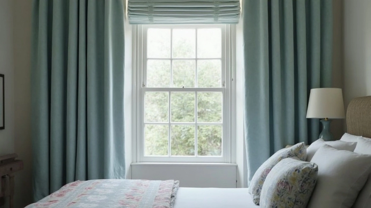
Colors bounce or absorb light. Light shades like white, cream, or soft gray reflect sunlight and brighten up the room. Dark shades, on the other hand, soak up light and can shrink how big your space feels, even if you haven’t moved a thing.
The science checks out: According to a survey by The Interior Design Institute (2023), 76% of designers say curtain color is one of the top three features for making rooms seem larger or smaller. After all, in a small bedroom or a cozy living room, the wrong curtain color can feel suffocating. The right one? It does the opposite, fooling the eye into seeing extra inches everywhere.
- If your curtains match or are close to your wall color, the area sort of “melts” together, so your eyes never hit a hard stopping point.
- Choose lighter curtain colors for small rooms with not much natural light. They bounce whatever sunlight they get, spreading it out.
- Go for full-length curtains. Hanging them a bit above the window frame stretches the wall visually and makes your ceiling look higher.
| Color Type | Effect on Room Size |
|---|---|
| Light/Neutral | Makes room look bigger and brighter |
| Dark/Heavy | Makes room feel smaller and more closed in |
| Matching Wall | Expands space visually, seamless look |
No matter your style, paying attention to curtain color helps you squeeze the most space out of any room—without knocking down a wall or buying new furniture. And if you're serious about curtains, you want every design choice working to your advantage.
Light vs. Dark Colors: The Visual Impact
Color isn’t just about style—it’s basically a room’s cheat code. Light and dark curtains play totally different games with your space. Here’s what’s really going on.
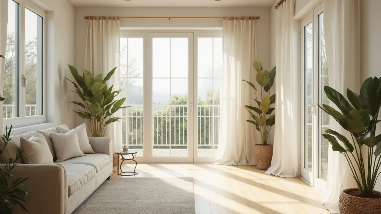
Light-colored curtains—think white, pale gray, cream, or blush—don’t just look clean, they actually help spread sunlight. That bouncing effect gives your room an open, never-cluttered look, even if it’s small. If your windows face north or don’t get much sun, light curtains are like turning up the brightness without getting new lamps.
| Curtain Color | Room Effect | Common Shades |
|---|---|---|
| Light | Makes space feel bigger and brighter | White, off-white, light gray, pastel blue, beige |
| Dark | Can make space feel cozier, sometimes smaller | Deep blue, charcoal, forest green, burgundy |
Dark curtains aren’t always a bad move. They give a dramatic, snug, or even luxurious vibe. The problem? They block or absorb light, which means shadows grow and your walls seem to move in. If your goal is to create the illusion of more room, dark shades probably won’t help. In small bedrooms or apartments, people usually regret using heavy, super-dark curtains because it ends up feeling way more like a den than a retreat.
- Light colors = reflect light, big-room feel
- Dark colors = absorb light, cozy but can shrink space
One interesting fact: A study from the International Association of Color Consultants found that curtains matching the wall color (especially if light) boost the illusion of space by making the window frame "disappear". People walk in and don’t notice where the wall stops and fabric starts, so the whole room feels less chopped up. So, if you want real impact, go for light curtains that blend with your walls.
Popular Curtain Colors for Bigger Spaces
If you want your room to look and feel bigger, reach for curtain colors that are on the lighter side. That’s not just a design hunch—it works because light shades naturally reflect more sunlight, making your whole space feel stretched out and bright. Designers have been using this trick for years, and it’s backed up by basic science about how our eyes perceive color and light.
The most popular curtain colors to make a room feel roomy include:
- White, off-white, and cream—classic, works in almost any setting, and maximizes brightness.
- Light gray—gives a modern vibe, softens the look, and pairs well with both cool and warm colors in your decor.
- Pale beige and taupe—these are go-tos if you want warmth but not the fuss of bright white.
- Soft pastels like blush, sky blue, or light sage—these add a touch of color without making the window area look heavy.
If you’re working with small rooms, match your curtain color as closely as possible to your wall color—this means fewer visual lines to break up your space. When curtain and wall colors blend, the window doesn’t chop up the view, so everything seems to flow together and look bigger.
Dark colors and heavy patterns make windows stand out, grabbing all the attention—and making the area feel boxed in. Unless you’re intentionally going for a dramatic look, avoid deep navy, black, or intense jewel tones for curtain panels in tight spaces.
| Curtain Color | Perceived Room Size | Effect on Light |
|---|---|---|
| White / Off-white | Much bigger | Reflects maximum light |
| Light Gray | Bigger | Reflects plenty, adds softness |
| Pale Beige / Taupe | Bigger | Warm, cozy, but open feel |
| Soft Pastels | Slightly bigger | Add light color, no heaviness |
| Dark Colors | Smaller | Absorbs light, makes space feel closed in |
One last tip: keep the curtain fabric light, too. Heavy velvets and dark linens will soak up more light no matter what the color. Want that lifted, spacious look? Go for cotton, voile, or linen blends in pale shades—they’ll do the job every time.
Tips for Matching Curtains with Walls and Furnishings
Getting your curtains to work with your walls and furniture isn't rocket science, but there are a few things you really don’t want to mess up. The color you pick can make your space look huge… or more like a storage closet. Here’s what really matters.
- Blend with the walls: The oldest trick in the book—pick curtain colors close to your wall color. This creates a seamless look that tricks the eye and makes walls seem to stretch farther. For example, if your walls are pale gray, go for light gray or dove tones for your curtains. This works especially well with rooms that don’t get a ton of light.
- Go a shade lighter or darker: If you don’t want a perfect match, picking a curtain one or two shades lighter or darker than your wall gives you some depth without breaking up the space visually.
- Neutrals = easy win: Soft beiges, light grays, and even muted blushes are classic for a reason. They play nice with almost any wall or couch color and always help bounce light around.
- Watch out for heavy patterns: Big, bold prints or super dark curtains can chunk up the room. If you love patterns, stick with something subtle in a similar color family as your walls or sofa.
- Furniture matters too: Got a bold green couch or navy armchair? Make sure your curtains don’t clash—think complementary shades, or neutrals that won’t compete.
Here’s a quick look at how curtain choices impact perceived space:
| Combo | Room Looks Bigger? | Notes |
|---|---|---|
| Light curtain + light wall | Yes | Merges together, lifts the space |
| Dark curtain + light wall | No | Makes room feel shorter and smaller |
| Patterned curtain + busy furniture | No | Room looks cluttered fast |
| Neutral curtain + colored sofa | Yes | Keeps the vibe open and balanced |
Matching your curtains with your walls and furniture is kind of like picking out a good outfit—when the pieces work together, everything looks intentional and way more put together. Don’t be afraid to play with swatches or samples before you commit. Natural light can shift how colors look throughout the day, so check them out morning to night before making your final call.
Common Mistakes to Steer Clear Of
People often think picking any light curtain will do the trick, but not all light colors work the same magic. Here’s where things go sideways: if your curtain color clashes hard with your wall color, it actually cuts up the space, making the room feel boxed in rather than bigger. Also, heavy patterns or super dark fabrics overwhelm small rooms and suck up the little light you have.
One classic mistake? Hanging curtains right at the top of the window. That makes ceilings feel lower and windows smaller. You want to install rods close to the ceiling and let the curtains drop all the way to the floor. Don’t stop at the sill—go long if you want to stretch the room up and out.
Another misstep is choosing the exact same shade as your walls but in a much shinier or heavier fabric. Matched shades can work wonders, but if the finish looks totally different, it stands out awkwardly instead of blending in. Stick with a similar texture or a subtle shade change to keep things seamless.
According to design expert Sarah Richardson,
“Matching your curtains to your wall color in a close tone makes the space feel more expansive, but avoid mixing matte walls with super shiny curtains—it breaks the visual flow.”
- Avoid busy prints and big contrasts with your wall color.
- Don’t go for really thick, dark curtain fabrics in small or low-light rooms.
- Don’t skimp on curtain length—floor-length always makes a space look taller.
- Mind the hardware: chunky rods or overly decorative finials can pull attention away from the openness you’re creating.
Keep these details in mind and you’ll dodge the most common pitfalls when trying to make your room seem larger with smart curtain color choices.